By Chris Schneiter
Recently, I happened to watcha video from Bruce Barnbaumabout the importance of giving enough exposure when shooting film. This is something that I had discovered too. As an avid practitioner of the Zone System, I learned early on that if I placed my shadows in Zone IV instead of Zone III, they had more substance and were easier to print. His description of what was actually happening got me thinking though. His contention was that if you give more exposure to film, that it gives more contrast to the shadows, and therefore makes detail more visible. I began to relate that to what I’ve also observed in digital output.
I have noticed that in most cases, when I’m printing an image with a “Normal” tonal range, one with about a 5-7 stop range, with well separated highlights, and full shadows, that my calibration between monitor and printer seem to be fairly linear. The problem seems to come with very Low Key images, and even with images with a very wide gamut. Most of my images have a very long tonal range and a wide gamut.
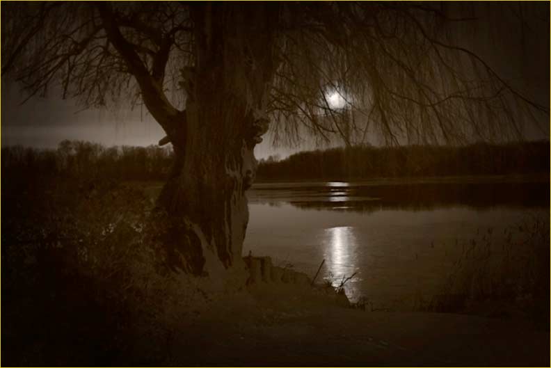
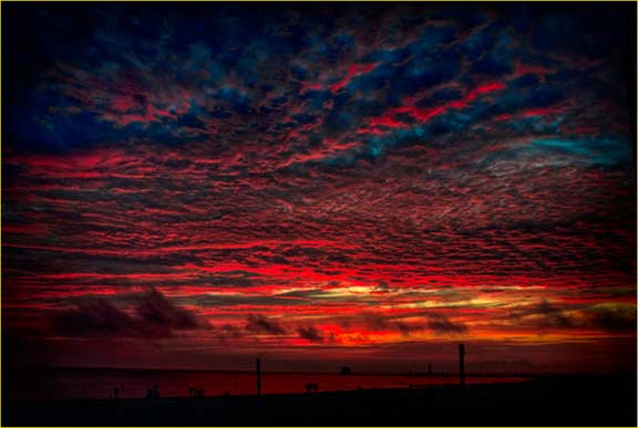
When I began to notice this was on a very low key image of the Moon over a lake. I was printing an exhibition, and had made several prints of primarily mid range images when I came across this zinger. It looked fine on the monitor, yet when I printed it, the low end absolutely died. At first, I thought that my calibration had mysteriously shifted, or that I may have used an incorrect output profile, but that couldn’t have been the case, as I had just made several very satisfying mid range prints, and they were fine. So in the end, I put a lightening curve on the image (favoring the shadows), made a nice print and moved on.
Something about what Barnbaum said about placing the shadows on Zone IV and contrast jarred my memories of doing the same thing, and suddenly I realized that that was what was happening with digital output too. In this article, I’ll attempt to explain my observations, and hopefully provide some solutions to those of you who may be experiencing the same thing.
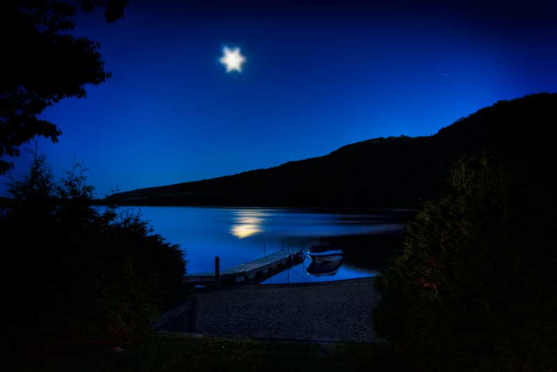
Moon over Monocle Lake, 2010
This is the image referred to above. The subtle shadow detail was submerged.
THE TONE CURVE. KEY TO THE KINGDOM
In Barnbaum’s video, he gave a very good description of the Tone Curve and why shadow detail may block up. His contention was that with film, when you expose shadows for Zone III, as was recommended in most early Zone System manuals, you are giving the bare minimum amount of exposure, based upon sensitometric recommendations. In the early days, most data was compiled under scientific lab conditions, using pie-in-the- sky ideals of what exposure should be. But in the real world, this didn’t always work. Again, as long as you had a mid-range image, without extreme highlights or shadows, you would be fine. Unfortunately though, we have this artistic expression preference. Mid-range images are not always very interesting, and sometimes, we want to push the limits of the tonal range. If we follow conventional advice, we run into problems.
The tone curve (or Characteristic Curve) is a graphical depiction of the tones present in the image. Plotted in the 1870’s by the early sensitometric team Hurter and Driffield ( http://en.wikipedia.org/wiki/Sensitometry ), the curve shows that as density in the image increases, the plot goes higher on the curve. Shadows reside on the left, low end of the curve, or the toe, and highlights on the right higher end, or shoulder. The straight line section of the curve is an indicator of contrast.
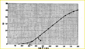
A typical curve
Shadows are on the left, and highlights are on the right.
This would be a curve for a normal image, with a lot of mid range detail, a smooth transition into shadow and controlled highlights. Curves progress in predictable increments (stops) and are indicated on this curve by dots. Note that on the curve, in the mid-range section, that the dots are more spread out, and at the toe and shoulder they are compressed. This is very significant. Where the dots are more spread out, there is more separation between tones, allowing detail to be more visible.
However, and the premise for this essay, is that in the toe and shoulder of the curve, separation (contrast) is compressed,, and detail is merged. In the case of low key images, dark areas will all mush together and the image will look dark. This is true, whether we are shooting film or digital. With negative film, we must expose that density into the image, and it is easier to control highlights by printing them in. If we don’t have density in the shadows, it is lost on film, and in shooting digitally or transparency, we must have the detail in the highlights and are able to control shadows easier.
So, to maintain sufficient shadows, we must somehow increase their contrast, and bring them up on the curve where there is more separation. One solution is to increase the contrast in the shadows. The incline of the straight line section is an indicator of contrast. With negative film, we expose more (for Zone IV instead of Zone III) bringing the shadow detail up to where we can see it. Digitally, we can simply increase that incline in a curves palette.
I will go back to the Moon over the lake. Ultimately, I put a mid-tone lightening curve on it, which allowed the detail to show.
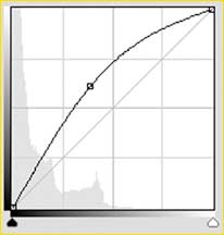
Lightening curve used on Moon over Monocle Lake, 2010
Most of us are familiar with this curve. I’ve grabbed the mid-tones and dragged them up until I got what I wanted. But let’s look at the shape of the curve. By achieving my desired look, note that the final slope of the curve is much steeper on the lower half, giving much more contrast to the shadows, and actually, the highlight end flattens out and maintains highlight detail. Neither end of the curve was moved, so my white and black points remained the same. The only difference was contrast. This is what Barnbaum was talking about by giving more exposure in the shadows. Unfortunately, we can’t do that when shooting digitally, or we will lose highlight detail. Let’s look at another image. This is another one that defied calibration. It looked fine on the monitor, but when printed, didn’t fit.
Moon Over Park Lake, 2011
In this image, there were velvety blacks, but there was also new snow on the ground and the trunk of the tree. On the monitor, there was a beautiful subtle shadow detail, but when printed, the shadows compressed. Again, I questioned my calibration, but I also had printed more conventional tonal ranges. So once again, a lightening curve was applied. This is the cure. Remarkably similar to the first curve. Note that again, the contrast is increased on the shadow end, but the highlights level off to maintain highlight detail.
Curve from Moon over Park Lake, 2011
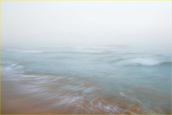
Occasionally, there is an image that is nice, but just doesn’t have that “snap” that you might want. I tend to be very pragmatic in my printing. I think it comes from my film days. When I’m producing an image, I work on it until I’m fairly satisfied , then make a print, put up and look at it (usually on the refrigerator!). This Image was one I had a problem with, but I liked it enough to work on it. After about a week, I realized that what was bothering me was that the water had no dynamics. It just sat there, yet I could see that there were tonal differences in the blurred waves. Again, as is my habit, this is beginning to fall into the Low Key realm. This is what it looked like originally.
I came to the conclusion that I needed more contrast in just the water. The curve allows us to not only make global corrections, but will also let us make tiny little local corrections, in this case, only on the tops of the waves. Using a curves palette, you will see a little hand figure. If you click on this, it will create an eyedropper. If you place this over the area in the image that you want to correct, it will show you where it falls on the curve (In the palette). In this case, the tops of the waves fell below the mid tone point. By clicking on the curve, I was able to lock down the entire curve, except for that point. I then raised only that point to increase the density and contrast only there, leaving the rest of the image unaffected. This added a great deal of life to the image. Here’s what the curve looks like.
Curve for the image above.
Note the hand figure. This gives you an eye dropper to allow you to localize tones.
This is the final image. Look at the tops of the waves on the right side. Making them brighter adds a lot of life to the image.
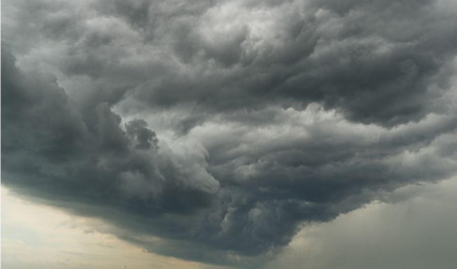
Incoming Storm, Whitefish Bay, 2010 Before
Incoming Storm, Whitefish Bay, 2010 Final Image
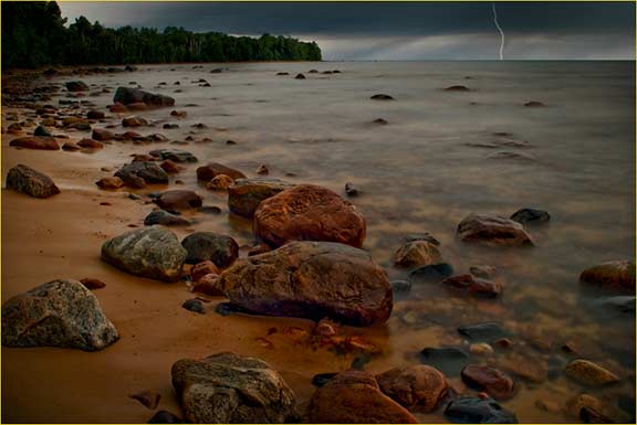
Other images may be just as extreme, but don’t respond well to the contrast argument. I tend to shoot images not only with a long tonal range, but also with very wide gamut. I always export my images in Prophoto color space, so that any wide gamut colors are easier to cope with. Conventionally, we think of ink jet output space as being Adobe ’98, but in the following image, after being converted to Adobe ’98, the dark areas in the image did just what the others did. They died. In this case however, when I tried to put a lightening curve on the image, the colors shifted and washed out. After hours of frustration, I realized that my problem wasn’t necessarily that of low shadow contrast, but rather a color gamut that was too wide for my output. I ended up printing the image in Prophoto. Even in converting the image to Adobe ’98, I could see the colors shift on the monitor. By the time they got to print, all my separation was gone. In this case, printing in a wider input space solved the problem.
City Beach, Grand Haven, MI 2010
Printing in a wider gamut maintained color fidelity and shadow separation.
Knowledge of Color Management is essential. The curve is a very useful tool. See it as not only a way to control brightness, but almost more importantly, think about where tones are falling in the range and what might be happening to them because of their placement. If there are tones that are falling outside of the straight line section of the curve, in the toe or the shoulder, they will be in danger of losing contrast. You don’t just have to accept what your images are giving you. You can control every bit of the tonal range.
RGB AND YOUR DENSITOMETER
Let’s not forget to talk about the RGB Scale and using the the densitometer. First, if you’re not using your densitometer you should be. Keep your info palette up on your screen at all times. The reason is this: points on the RGB scale identify what your image is doing, and can tell you how your image will reproduce. Also, numbers don’t lie. If you know your numbers, you won’t be fooled by viewing illumination, or variations in calibration, how long your monitor has been on, or how much sleep you had last night. You will know.
For the uninitiated, the scale goes from 0, pure black, to 255, pure white. In between are all the densities that matter. It is very important for you to know which numbers are important. You need to know what your minimum shadow density is for your given output. For web, for instance, in an srgb working space, your minimum might be about RGB 20-30, but if for instance, you are printing ink jet on matte paper, you black point might be upwards of 40. It is very important to pay attention to this number, and find out where your shadows begin to separate. The other very important numbers to pay attention to are your highlights. 240 RGB is a good number to aim at for textured highlights. I like to think of this as the digital equivalent of Zone VII. This will separate cleanly and convincingly from pure white. 250 RGB will be your first separation from pure white, but will not hold detail. It’s up where the curve begins to flatten out.
Sometimes, you may need just a little density at the edge of an image to keep it from blending into the white of the paper. In this case use your densitometer to measure just how much you need to burn down. This image has the edges subtly burned down to 240 RGB to separate them from the white of the paper.
Water and Fog, 2008
The upper edges of this image were burned down to 240 RGB for separation.
“LOOK, EVEN ANSEL IS HAPPY IF HE GETS WITHIN A STOP”
So, where does all this curve talk leave us? Now, you’re thinking about all the money that you’ve spent on calibration equipment. In this day and age, color management has become almost a religion. By rigidly calibrating our systems, we can spit out consistent prints day in and day out, right? We live in a WYSIWIG world, and all we need to do is follow the rules. But as I said above, this is true as long as you are shooting mid-range images with controlled highlights and full shadows, but some of us like to go beyond those limits, and feel compelled to break the rules. Also, once again, as with the Zone System, Color Management rules are made by scientists, under controlled circumstances, which often don’t relate to the real world. They don’t allow for variability or artistic intent. To illustrate this, I’ll tell you a little story.
As a young student at RIT in the mid 70’s, I decided that I wanted to know everything there was to know about the Zone System. I tested and tested film and prints (calibration in those days), and in the lab, I had absolutely beautiful data. Everything fell where it should go, and I really worked at it. I was cool, I was shooting sheet film, and using a spot meter. I remember telling Terry Bollman (One of my most respected teachers, and a co-author of “The Zone Systemizer”. Anybody who was there then will remember him) about all my testing. At that point, I think I had gone through about 200 sheets of 4×5 film just testing. Terry’s reply was “Oh, that’s too bad.” I see my students doing the same thing, working hard at one technique or using a cool piece of equipment thinking that it will bring out the genius in them. It will, just not as they expect. They’ll learn a lot, even if it doesn’t translate into brilliant images.
At any rate, after all of this testing, I was ready to shoot. I’d go out and shoot, but when I came back and processed, my images appeared flat, and tones may not have been as I expected. In the strictest sense, my impression was that if you do Zone system correctly, you can just put your negative in the enlarger at your calibrated height , aperture and time, and it will just print.( Is this starting to sound like the whole color management argument?) In reality, yes, my images printed, and if they were properly exposed and processed, they gave a good mid-range print. But they didn’t do it for me. they weren’t expressive.
So after seemingly months of frustration, I decided to consult the Oracle. Richard Zakia, (a co-author with Minor White on “The New Zone System Manual”, still, I think was one of the best manuals written on the subject) was The Director of our Photo Program. I resolved to go get the answers from him. So I went.
“Knock, knock, knock“, Door opens. “Doctor Zakia, I wondered if I could ask you a question“. “Is it about the Zone System? Because if it is, I don’t want to answer it, because if I do, somebody else will ask, and then I’ll end up teaching a class, and I don’t want to do that!” “Oh, ok…” I walked down the hall mortified. “All Right, Come in“.. so with my heart in my throat, I went into his office, and told him my tale of woe. He paused, and his reply was simple: “Look, even Ansel is happy if he gets within a stop!” “Oh, Ok…” I walked away feeling as if I’d talked to Buddha, with as many questions as I had answers.
The moral to this story is that no matter how great your data or calibration is, you still have to learn how to use it. I had to learn that my shadows looked better If I exposed them for Zone IV instead of Zone III as the Sensitometrists dictated, and that even though Caucasian skin is conventionally thought of as Zone VI, my wife’s skin was very light and transparent, closer to Zone VII.
We all know what it takes to achieve a good exposure, and we can make a good image on a monitor, especially with mid-range images. But many people have the idea that digital printing is a cookie cutter activity. To be expressive, sometimes we need to push the envelope. To do this, we have to consider the whole process. This is no less important than it was with film.
INPUT AND OUTPUT, NOT THE SAME THING
As I said above, Color Management is the newest buzz phrase and almost a religion. Doctrine says “Thou shalt not deviate from your profile”! This is fine in theory, but is kind of wrong (I can hear the villagers with pitchforks and torches outside my door!) . Your Monitor and your print output are two very different things. To me, the object of calibration is to bring you to a mean.. a common look so that you can compare your Monitor to your output source. If you are working for the web, usually monitor calibration is about all you have to do. Now that most people calibrate, chances are someone in China is seeing the same densities as you are. But with a print as output, it becomes much more complex. For me, I try to view my calibration as giving me the “Character” of what I see on my monitor on my print. I don’t believe that it’s possible to have an absolute match (Oh! I smell the smoke from the torches!).
I calibrate regularly. Really. And I’ve found that newer output canned profiles are really pretty good. I used to be obsessed with custom profiles. I thought they gave me more shadow separation (might be good for many of my low key images), but in general, for mid range images, many looked too soft, and I ended up adding contrast anyway. After I calibrate, I usually “tweak” the brightness of my monitor to more closely “match” my print output. I know this is a hangable offense, but when you think about it, judging the brightness of your monitor by looking for a pattern to just start emerging is subjective at best, and doesn’t allow for viewing brightness, monitor instability or how much sleep I got last night. Letting your colorimeter do it is just as imprecise, because it doesn’t take into account variability in your printer or your image. Custom printer profiles help, but they don’t take your monitor into account. They assume perfection and controlled conditions, which we know is not always realistic. Your monitor works in RGB. Just 3 colors, Red, Green and Blue. It’s rear illuminated, and white is the absence of density, and black is the absence of light. Prints are created in CMYK. 4 colors. Cyan, Magenta Yellow and Black. White comes from the substrate, and black is added, because CM&Y make an ugly brown. On top of that, even with very accurate profiles, the nature of your paper will effect how it looks and how the tonal range records.
You can see that the two outputs are very different, so I don’t think it’s realistic to assume that they will match. Look for the “feeling” of the image. Density should match, but there will be variables.
AS ALWAYS, HAVE FUN!
At least for me, printing and color management are fun. Calibration quantifies and controls your output, whether that be for monitor viewing or print output. The concepts have continued and are basically the same as those that we observed in the past. Just be aware that output is not just a matter of pushing buttons, but must be understood to be controlled.
Ansel Adams used to make correlations between photography and music. One well known quote is “The Negative is the score. The Print is the performance of that score“. Even though Photographic imaging has become seemingly and perhaps deceptively simple, to make a truly fine, expressive print, you must take a total view of the whole process, from capture, all the way through editing, and finally to the print. The final print still has to be a performance.
October 2022
(Original) January, 2013
©Christopher Schneiter 2013
www.christopherschneiter.com ces@christopherschneiter.com
www.fireflyphotoworkshops.com
Lorem ipsum dolor sit amet, consectetur adipiscing elit, sed do eiusmod tempor incididunt ut labore et dolore magna aliqua. Ut enim ad minim veniam, quis nostrud exercitation ullamco laboris nisi ut aliquip ex ea commodo consequat. Duis aute irure dolor in reprehenderit in voluptate velit esse cillum dolore eu fugiat nulla pariatur. Excepteur sint occaecat cupidatat non proident, sunt in culpa qui officia deserunt mollit anim id est laborum.
Lorem ipsum dolor sit amet, consectetur adipiscing elit, sed do eiusmod tempor incididunt ut labore et dolore magna aliqua. Ut enim ad minim veniam, quis nostrud exercitation ullamco laboris nisi ut aliquip ex ea commodo consequat. Duis aute irure dolor in reprehenderit in voluptate velit esse cillum dolore eu fugiat nulla pariatur. Excepteur sint occaecat cupidatat non proident, sunt in culpa qui officia deserunt mollit anim id est laborum.
Lorem ipsum dolor sit amet, consectetur adipiscing elit, sed do eiusmod tempor incididunt ut labore et dolore magna aliqua. Ut enim ad minim veniam, quis nostrud exercitation ullamco laboris nisi ut aliquip ex ea commodo consequat. Duis aute irure dolor in reprehenderit in voluptate velit esse cillum dolore eu fugiat nulla pariatur. Excepteur sint occaecat cupidatat non proident, sunt in culpa qui officia deserunt mollit anim id est laborum.
Lorem ipsum dolor sit amet, consectetur adipiscing elit, sed do eiusmod tempor incididunt ut labore et dolore magna aliqua. Ut enim ad minim veniam, quis nostrud exercitation ullamco laboris nisi ut aliquip ex ea commodo consequat. Duis aute irure dolor in reprehenderit in voluptate velit esse cillum dolore eu fugiat nulla pariatur. Excepteur sint occaecat cupidatat non proident, sunt in culpa qui officia deserunt mollit anim id est laborum.
Born December 30th 1954 Began Photographing 1969 in Kalamazoo Michigan Bachelor of Fine Arts, Photographic Illustration, 1978 Rochester Institute of Technology Adjunct Associate Professor of Photography, Lansing Community College, Lansing, MI
You May Also Enjoy...
Hand’s On: new Sony A9III and Sony 50mm G Master, Sony 85mm G Master, Sony 75-350mm APS lenses
A quick hands on look at Sony A9iii and the Sony APS 75-350mm len
The best wide-angle zoom in the world? The Fujinon G5 20-35mm f4 R WR reviewed.
FUJIFILM GF 20-35mm f/4 R WR L
