
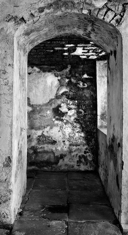
Lucien’s Fence, 1997
4×5 Wista View Camera, 150mm Zeiss Protar, Tri-X
The B&W Master Print
Simply applying a technical trick like some magic wand that one can wave over paper and ink will not, in itself, produce a masterpiece. If we look at the history of black-and-white photography and the great pictures it has given us, it is the honesty of presence through the articulation of the black-and-white scale that gives credence to black-and-white masterpieces. Luminosity creates our world as photographers, and it is this understanding and portrayal of light that ultimately produces presence.The authentic portrayal of presence produces a masterpiece.
Art historian Kenneth Clark, in his small book,What is a Masterpiece, calls a masterpiece the “creation of an individual artist’s authentic genius.” A masterpiece is first of all a creation. It is a picture that is not borrowed or stolen, and though it is perhaps derivative in nature, it is made out of the stuff of the universe, unique and often unbidden. Secondly, a masterpiece is the creation of an individual artist, not a collaboration or committee. The work comes solely from an individual creating from a solitary position. Thirdly, and most importantly, a masterpiece is the result of the individual artist’s authentic genius.
It is this authenticity, and its technical and aesthetic manifestations –presence– that is reflected in the work of a master photographer.
Ansel Adams used the word presence to describe a print that was “finished.” He had no definition for the word “presence,” so I’ll try to describe its importance, explain how it is brought out in a print, and discuss what I believe is the best method to produce it consistently.
What is Presence?
The fine print represents, to me, an expresssive object of beauty and excellence.
The difference between a very good print and a fine print is quite subtle and difficult, if not impossible, to describe in words.
There is a feeling of satisfaction in the presence of a fine print – and uneasiness with a print that falls short of optimum quality.
Ansel Adams – The Print
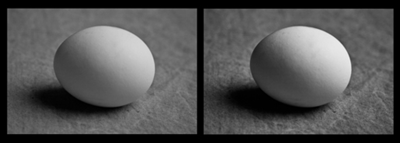
Behind all the inventions, techniques, and movements in painting and photography lies a fundamental truth about the inherent degree of visual perception involved in each: What the painter represents on canvas is a representation of what is visually perceived, while what the photographer represents in an unaltered image is only what is actually seen, not what it visually perceived. What is seen by the retina of your eye or the sensor of your digital camera represents a quantity of light as it falls on a subject or scene. This quantity of light is known as luminance. Luminance combines both the surface reflective nature of the scene being photographed as well as the illumination falling on the scene. What is visually perceived (and painted by a painter) is a many faceted neural operation that separates reflection and illumination and combines them with edge definition, depth, form, and wholeness—a process that, for the artist, is inherently more “real” than what we take for realism in a photograph.
The irony of this situation is that photography was invented to depict reality, but some might argue that a great representational painting is more real than a photograph because it takes human perception into account rather than just the raw act of seeing. Great photographers in history have often expressed their intuitive sense of this discrepancy between seeing and perceiving. These masters sought to manipulate the image to correspond to their perception of reality rather than take what is given to them by the camera. This effort by the great masters of the medium of photography to go from seeing (Luminance) to perceiving (Luminosity)is manifested by the strong presence in their prints.
Here is the difference between Luminance (seeing) and Luminosity (perception).

Luminance

Luminosity
Luminance Luminosity
In the darkroom, a master was able to manipulate, through years of experience, the sense of presence by turning the flat Luminance image into the faux 3D Luminosity image. This is what Ansel was talking about when he talked about presence. To do this manually, in the darkroom, with primitive burning and dodging tools, requires intense complex technical and intuitive skill. Most photographers think that this inherent Luminance vs. Luminosity problem goes away with the advent of Photoshop and Lightroom. Nothing could be further from the truth. In fact, the problem is compounded, because we have more tools with which to create more mistakes and confusion.
The basic physical difference between the two states – Luminance and Luminosity – is largely one of defining edges and altering contrast. This sounds easy, but so does knocking a little white ball around into a hole. Photographers have said to me that they can perform these operations in Photoshop – and, well – that’s true – just like anyone could go into the darkroom and burn and dodge. It’s how you define the edges and the contrast that’s important, and it takes years of practice to find what we call the differential edge and contrast manipulations involved.
In the brain here’s what happens to the luminance image:
1. The visual cortex finds the edges in the luminance image and separates those edges into two categories: reflected edges and illuminated edges. (Remember that luminance is a combination of the surface reflective nature of the scene being photographed as the illumination falling on that scene.)
2. The image is then spatially (differential contrast) processed to create a perception of depth. Contrast and edges working together.
3. Based on edge and depth classification, the tonal values are filled into complete frameworks (highlights and shadows). In each framework (either highlight framework or shadow framework), the image is anchored to the highest value within it. The strength of a framework depends on three factors:
Size – This relates to the size of the framework relative to the other frameworks in the image. The larger the framework, the greater its relevance in the image.
Articulation – This is the number of distinct black and white tonal values in the framework. The greater the articulation, the stronger the image.
Grouping factors – Grouping factors are the visual grouping principles of edges, patterns, and the similarity and proximity of tonal values to one another. Anything that groups in a local framework strengthens the overall image.
4. The final percept (luminosity) image is created by adding the illumination image (perceived directly by the retina and separated at the beginning of the process) back into the mix.
Creating Presence
You can, of course, fiddle around with global and local contrast and edge enhancement until the cows come home (or the fifth of scotch is gone, according to Gene Smith). However, three years ago a colleague, Chris Russ, and I took these basic perceptual ideas and made a plug-in for Photoshop called PercepTool TM . PercepTool 2 TM , the latest version, improves the perception function, and allows photographers to globally approach what theluminosityimage represents. You still have to manipulate local tones afterward, but the process is made a lot easier with PercepTool 2 TM . The tool gives you a great jump on the quality ofpresence. (www.georgedewolfe.com).
Besides PercepTool 2 TM I have a few local techniques that also enhance presence.
Fine Tuning Local Areas: The History Brush
Simple Tools, Precise Control
Here I’m going to demonstrate the use of one tool that does many things: the History Brush. The History brush is the tool of an artist. Artists, when they make a mark (a brush stroke), or photographers when they make a print, move forward in a positive, courageous way. We rely only on our intuition and craft to bring us to the final, successful destination that is the painting or print. If the artwork doesn’t turn out the way we want, we erase it, or cover it up, or throw it in the trash can, and try again. We may do this five to twenty or more times until the work is finished. It is a matter of iteration, back and forth, back and forth.
A Reminder
The key to this process is perception, not a technical trick. If you can’t see the problem—brightness, contrast, softness, sharpness or whatever it is—then no technique in the world will make your print better. Not one. This is the basic problem I face every time I teach Photoshop and Lightroom in a Master Print workshop. And even after I emphasize the fact that perception and problem diagnosis are more important than any technique, people still don’t get it (even intelligent people), and they end up with APS (Advanced Photoshop Syndrome) wondering why their photographs don’t turn out well.
Applying and refining one technique to a myriad of printing problems is the best way to learn about perception. This gives you a yardstick by which to measure success, and you don’t have to worry about how many tools you know. Perception and refinement of one or two techniques make the best print. I know a photographer who uses only Levels and Curves, and his photographs hang in major galleries. His greatest asset is that he was a black-and-white photographer for 30 years and he knows tonal values up one side and down the other, so he can see everything that happens in the print. Edward Weston, Ansel Adams and Minor White, three of the greatest printers in the history of photography, used traditional burning (local darkening) and dodging (local lightening), refined to a high degree, to produce their masterpieces.
The History brush, truly the only local tool you’ll need in Photoshop, is such a powerful solution to almost all local image problems, that I rarely use selections and masks anymore. The History brush is faster, more intuitive, more artist- and photographer-friendly, and easier to use than the host of tools that accomplish the same thing, especially layer masking. The History brush works like a real tool an artist or photographer uses. It lets the artist paint a correction relayed by perception, in precisely the place they want to paint it—instantly, with no hesitation, positively, and in a progressive forward direction. It stamps the artist’s mark of authenticity. A Master’s tools are always simple: Simple Tools – Precise Control.
Drawing with the Image, not Air
Using the History Brush uses the image itself to make a local adjustment. This is different from the corrections made with Masks and many Layers. The correction on a mask is painted with air. The difference is very graphic.
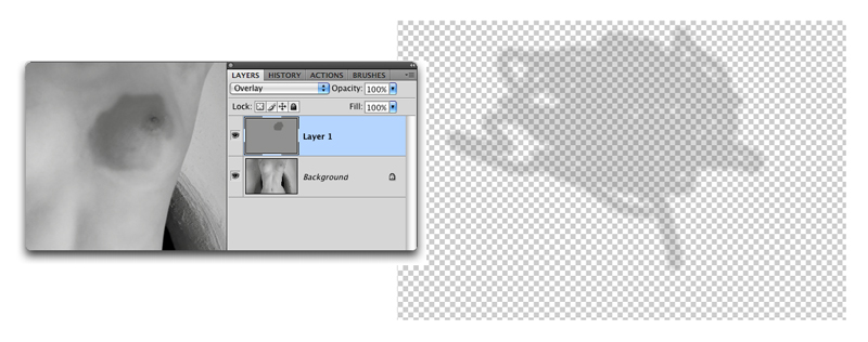
Layer Brushing
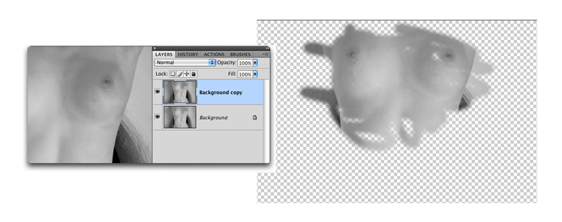
History Brush
Basic History Brush Technique
The basic History brush tool as I use it consists of the brush itself used on a background copy of the original image. The History Brush uses the first Snapshot (at the top of the History Palette) to paint the image with itself in various blending modes with different opacities. I employ the brush using only the Mode and the Opacity settings on the Options bar.
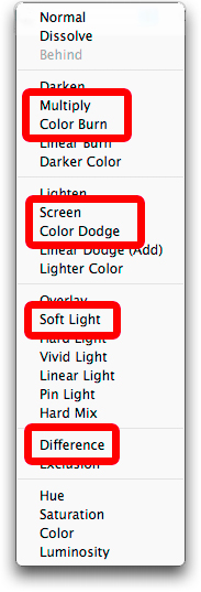
My favorite Modes are:
Multiply – darkens (burns) a local area.
Screen – lightens (dodges) a local area.
Color Dodge – lightens extreme small highlights.
Color Burn – darkens extreme small shadows.
Difference – darkens extreme highlights.
Soft Light – increases contrast in areas that have both light and dark areas.
LET’S TAKE A DETAILED EXAMPLE:
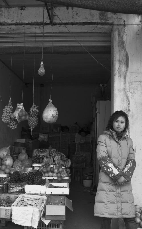
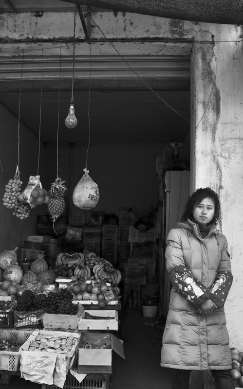
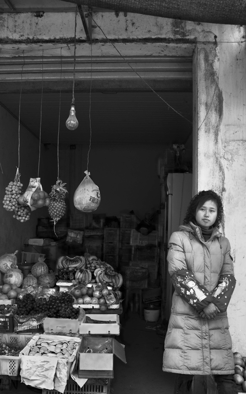
I’m going to work on this street seller from China. The image has already been through the Lightroom Workflow (found in my book,B&W Printing) and the PercepTool. It really looks very nice, but I can improve it quite a bit. First make a Background copy of the image by typing Command J (Mac) or Control J (PC).
Street Seller, China, 2006
This produce seller in China caught my attention immediately but all I had with me at the time was a Leica D-LUX 3. I love the clarity of the image this point and shoot camera gives me and, especially, its 16:9 “Chinese format.” The camera was hand-held. Unfortunately, the highlights on some of the white objects were clipped, but they are very small in the image and we can correct them acceptably. This photograph represents a complicated, but interesting, problem in local control, even though much has been accomplished already with Lightroom and the PercepTool.
Street Seller, China 2006, converted to B&W in Lightroom File after PercepTool 2
TM in Photoshop CS5
The first thing I do to diagnose an image at this stage is to blur it and stand back and look. Literally…stand back from the computer screen about 7-10 feet and really look at the blurred image on a black screen.
Diagnostic blurred image (Gaussian Blur 10)
Now… Stand back and look.
This process of standing back, looking, evaluating, and refining local problems can take some time, but it’s effort well spent. Occasionally, I’ll make a large print of the blurred image to get an even better look. Every great printer goes through this evaluation stage at the local control level. It’s crucial to the presence of the print. The critical questions to ask when looking at the blurred print is –
“What local areas are too bright or dark?”
“What local areas need to be modulated in form?”
Here’s what I see needs to be adjusted locally in the Produce Seller:
1. The central object is too light and needs to be darkened.
2. Foreground objects on left are to light.
3. The woman’s coat needs more form – it’s too flat in contrast.
4. The woman’s face needs to be lightened.
5. The background objects in the rear need more separation and brightness.
6. The top of the image could use some lightening and a slight amount of contrast.
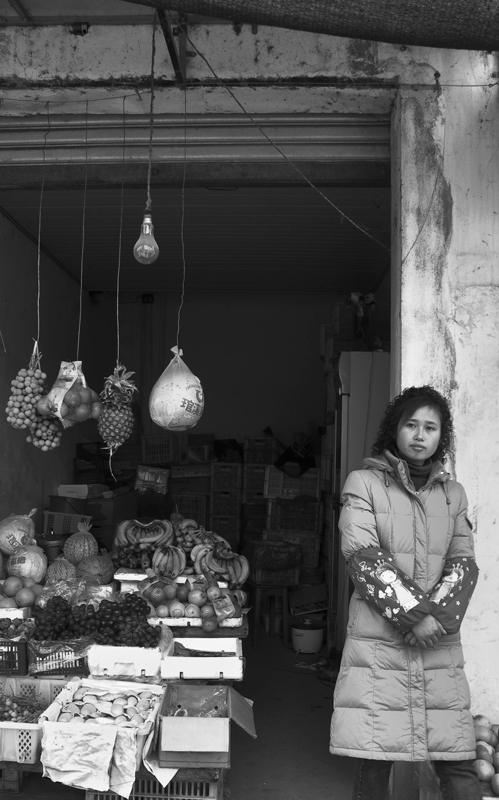
Here’s how I made the History Brush adjustments:
1. I darkened the central object on Multiply at about 15% Opacity.
2. The foreground objecs were darkened with Difference Mode at about 4%.
3. The woman’s coat highlight were lightened (Screen) and shadows darkened (Multiply) at between 15-25% Opacity.
4. Woman’s face was lightened with Screen.
5. The objects in the background were separated by brushing their highlights with screen and their shadows darkened with Color Burn at 3%.
6. The top of the image was lightened with screen at about 15% and Soft Light to increase contrast slightly at 15%.
Before History Brush changes After History Brush changes
It’s looking pretty good, but I still have some work to do. The whole bottom is now too light, so I’ll use Multiply with the History Brush to darken it a bit. This gives a better feeling of the light fall-off of an overcast sky. The only other touch the image needs is a little modulation and separation ( I call this articulation) of the produce on the and the cracks on the wall.
Original Image with final History Brush adjustments
Shaping Edges and Outlining for Depth
Softening and Sharpening Edges
I learned the importance of edge control when I was visiting James Bama, the reknowned American illustrator at his home in Cody, Wyoming. Jim said to me, “George, it’s all about edges, all about edges.” I’ve spent the last seven years making sense out of what he showed me in his own work that weekend. Like many illustrators, Jim works almost always from photographs. He has boxes and boxes of them on his shelves. He uses them as a starting point, but what he comes up with in the final painting looks more real than any photograph I’ve seen. This has to do with many things, not the least of which is that he is painting with the eye to make the image look real, whereas we are correcting a photograph to make it look real. The edges are the tools he uses to indicate depth, and he alters edges with both soft and hard strokes depending on whether he wants it to recede (soft brush stroke) or advance (hard brush strike). It’s all local work done with a brush. It just can’t be done with masks and layers.
I’ve been able to duplicate this effect by the use of the History Brush in its traditional mode and use sharpening (hardening) and blurring (softening) using the opacity slider to control softness or hardness, by brushing on the edges like he does.
Setting up the History Brush for Sharpening and Softening Edges
1. Open a photograph and choose Filter | Sharpen | Unsharp Mask
2. Set your parameters to:
Amount: 400
Radius: 1.5
Threshold: 0
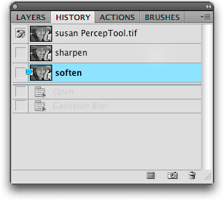
3. In the History Palette click on the little camera icon at the bottom of the palette. It creates a snapshot underneath the original one (at the very top of the palette). Double-click on thewords in the snapshot and rename it “sharpen” (see image below).
4. Back off 1 History State to Open.
5. Choose File | Blur | Gaussian Blur. Set the Radius to 10.0.
6. Make a snapshot like you did in Step 3 by clicking on the little camera
Rename the Snapshot “soften”.
Using this method is easy:
1. Check the little box to the left of the sharpen or soften snapshot.
2. Select the History Brush from the ToolBox.
3 In the Options Bar set the Mode to Normal and set the Opacity to 100% .
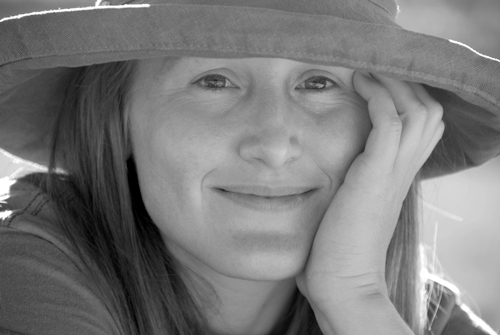
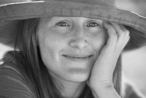
These two images show the original grayscale with Lightroom global adjustments and the PercepTool action with local sharpening and softening of edges. The front of the hat was sharpened with the History Brush locally at 100% and the eyes and some of the hair in highlight are sharpened at 30%. The softening starts at 100% Opacity with Gaussian Blur at 100% in the background, back rim of the hat, and her rear shoulders. The Opacity was reduced progressively to the front, with the hand edges receiving about 25%.
Review
Here’s a short list of how to manage local controls:
1. Blur the image and stand back from the computer screen.
2. Notice areas that need adjusting or that aren’t adjusted enough.
3. Make a list of those areas and what needs to be done to them.
4. Make the corrections using the History Brush.
5. Analyze the edges.
6. Correct edges by using sharpening in the frontmost object edges and blur as you go deeper into the image. This is a “selective” and local process, not a global one. Use it sparingly.
Outlining
Outlining accentuates the depth of individual objects in relation to one another. It does this by working with the occlusion (overlap) mechanism that the brain uses to separate one thing from another by depth. We accomplish this by using the History Brush usually in Multiply Mode to slightly darken around light edges. This not only separates one thing from another visually, but also acts as a kind of glue that accentuates a web of light that binds the whole image together and makes it appear whole.
Using the History Brush at an Opacity of about 10-20% on Multiply and Color Dodge at 7%, I outlined these onions. Use a very small brush and just go around the outside edges for the most part. Blend into other tones with less opacity on the pen tool. Color Dodge at low opacity picks out the very high highlights without bothering any of the other tones.

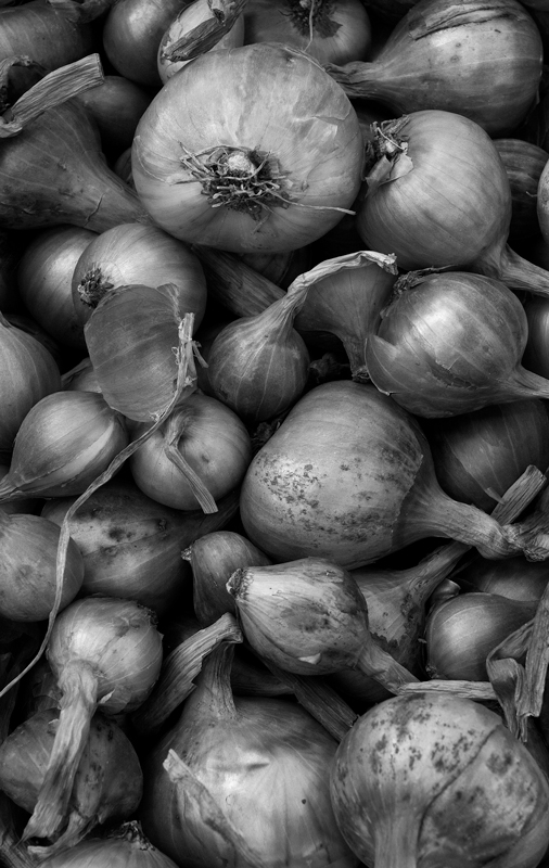
Before Outlining After Outlining
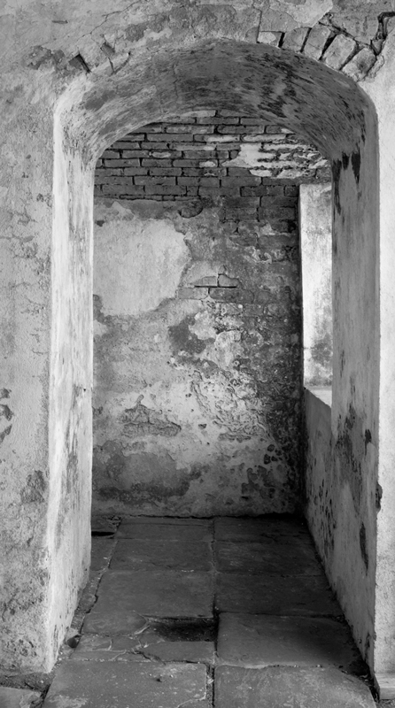
Here’s another one, using the same procedure:
This image required a lot of work. While the PercepTool and local controls took about half an hour, the outlining of cracks and objects to separate them from one another too twice that long. Look at the difference.
Printing
The printer, no matter which one you use or which process and inks you select, will only print what you’ve created in the camera and software. Presence is NOT created by the printer, it simply allows you to print what you have created on a consistent basis. In spite of that, photographers still believe there is some magic printer and process that is better than the rest.
I have tried and used all B&W inkjet printing solutions available.Here are some of the more important ones I’ve used:
Epson ABW (Advanced B&W) driver : This driver comes standard with all Epson professional printers and uses Epson standard inks. HP Black & White printer solutions (8190 and 3100): Standard professional HP B&W workflows with standard HP inks. MIS quadtone inks with Quadtone RIP : Third party quadtone (4 or more gray inks that replace the standard manufacturer’s ink sets) and a third party inexpensive driver. Piezography B&W with Quadtone RIP : Another third party quadtone inkset series with the third party Quadtone RIP driver. ColorByte ImagePrint : Third party driver for Epson professional printers that uses the Epson standard inksets.
In addition, I test papers frequently to see if any company has sneaked up on me and come up with something more brilliant than their last accomplishment. Every two years my wife and I carry out a brutal paper testing procedure. I buy between 25-35 25 sheet, 8.5×11 packages of different matte papers (no glossy). The selection is arbitrary{ some I really like, some I’ve seen and liked, some people have told me about and liked, some on a whim). Lydia gets half of each box and I get the other half. Each of us prints 4 photographs – 2 for B&W and 2 for color – from each paper selection. We print real photographs, not test charts. Each is marked with the brand and type. We then throw all of them on the studio floor ( and sometimes the living room carpet) and start culling. Our goal is to get down to 4 papers for color and 4 for B&W. It takes two weeks to do this. It’s really amazing, but usually we agree on the first two papers – independently. The major critera is how well the papers render detailed high values, translucent shadows, and well separated midtones.
Getting good and accurate B&W profiles for each paper, ink and printer combination is an outright journey of intense pain. I’ll bet I’ve spent $10,000 or more on profiling equipment trying to accomplish this hellish task. Even with the iOne spectrophotometer or the iSis strip reader and Profiler software the task is daunting. I’d also rather be photographing and printing or playing the banjo.
What I’ve finally settled on for a solution to fine art B&W printing is this: ColorByte ImagePrint .
Why?
1. ImagePrint is the most consistent of all the drivers and processes. I can repeat exactly any image I’ve printed with it before.
2. ImagePrint has over 27,000 profiles for over 400 papers and prints these accurately on everygood paper on the market, B&W and color. They are precisely linearized ( which means that the L channel (L for luminance) in the profile is a perfect straight line at a 45 degree angle on a graph). Most supplied Epson profiles, for instance, dip in the shadow areas in the L channel, thus causing prints to be dark.
3. ImagePrint allows you to print with the manufacturer’s inks, thus doing away with third party inks that are sometimes inconsistent and have a tendency to clog the printer nozzles. It also means that you can print in color, but don’t tell anybody. By the way – have you ever tried to overfill an Epson 110ml black ink cartridge? Try Windex or Fantastic to clean up after the explosion.
4. The quality is better than the other processes I’ve tried. This includes the HP and Epson B&W interfaces (which tend to print too green), poor profiles for all of standard printer drivers, a dirth of profiles for the Quadtone RIP, and dedicating inksets like MIS and Piezography to one printer (because they only print B&W). I ran a comparison for three months between Piezography and ImagePrint on identical Epson printers. The results we perilously close (which is why it took me three months to decide), but the many and varied advantages of ImagePrint sold me.ImagePrint outputs an excellent print on a consistent basis. None of the other solutions could guarantee these two qualities.
5. Unless you have a vast amount of experience in color science it is unwise to try to make B&W profiles for your printer. As indicated previously, I have worked at this for many years, and the basic problem is linearization of the profile, which can be done well enough in the Quatone RIP software, but still requires the expense of the iOne spectrophotometer, now over $1,000. With the purchase of ImagePrint, you get all these profiles, for the 3880, for instance, for $895. I would say cheap, at twice the price, from my experience. This, with the help of creating presence in the computer, makes the print that makes B&W the medium that it is.
The masterpiece, a creation of the artist’s individual authentic genius, is the result of this creation of presence.
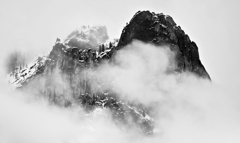
The Sentinel, Yosemite, Winter 2010
NIkon D700, 70-300mm Nikkor
George DeWolfe
You May Also Enjoy...
Mirror Self Portrait
Please use your browser'sBACKbutton to return to the page that brought you here.
