A Weekly Column By
Mike Johnston
Hartmann Single Black: A Procedure For Printing Scanned 35mm Black-and-White Negatives
‚ Part II‚
Nicholas Hartmann, who earned a PhD in archaeology and for the last twenty years has worked as a technical and scientific translator, has been a photographer for most of his life. He’s the son of the late Erich Hartmann, a longtime member and past president of Magnum Photos. By inclination and heritage, Nick‚ who grew up thinking it was normal for people like Inge Morath and Elliott Erwitt to come to the house for dinner‚ practices a fairly severe form of what might be called "the Magnum style": 35mm black-and-white photography, typically with a rangefinder camera and a 50mm lens.
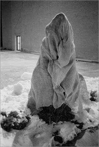 Milwaukee (N. Broadway), photograph‚© 2000 Nicholas Hartmann
MJ:It seems evident that working out the details of your single-black printing procedure on your own was important as you figured all this out, because I have to admit that I wasn’t very impressed when I saw your first experiments in this direction. (Maybe similar results initially are what turn some people off of experimenting with single-black prints.) The small prints had blown-out highlights and not terribly good detail. They lacked that certain "rightness" that good prints from any technique seem to have. But as you refined the process and learned what worked, the prints got better and better. What exactly did you learn to do?
NH:I certainly hope I’m getting better results now than when I first started! Practice improves almost anything, and digital printing is no exception. But I did find out some specific things as I climbed the learning curve:
First of all, although I have explored only a tiny corner of Photoshop’s immense capabilities, I now know how to manipulate a picture’s tonality‚ both globally and in detail‚ with far more precision and assurance than I ever could in the darkroom. I have also learned a lot more about the capabilities of my equipment: I know how to capture a good scan, the printer is properly set up, and I have identified an ink and paper that give me the results I want. Most importantly, I have arrived at a very faithful calibration of the entire "processing chain": I am now confident that what I see on the computer screen is what I will see on paper. That was achieved by way of endless monitor adjustments, testing and comparison of inks and papers, experiments with printer settings, and lastly a transfer function curve which fine-tunes the match between monitor image and printer output.
Your reaction to those first prints may also have been due to the fact that smaller inkjet prints in general look less satisfactory than larger ones, up to a point. Gelatin silver printing paper has essentially unlimited resolution: it is not necessary to use a special high-resolution paper for contact prints in order to see all the detail in the negative. But an inkjet printer prints at the same resolution no matter what the size of the overall image. If all the detail in an image has to be crammed into a small area, that resolution may be insufficient to express all the information. With a bigger image size, however, the printer’s resolution better matches the resolution of the image itself, and the detail has room to "breathe." I have found that with my scanner resolution (2820 ppi) and printer resolution (1440 dpi), an ISO 400 35mm negative printed full-frame starts looking good at an image size of 6 x 9" and is optimum at 10 x 15" (any bigger than that and the pixels start to show). Since my printer won’t accept paper any wider than 13", my present suite of equipment turns out to be quite well-coordinated.
MJ:That’s interesting, because your prints took a big jump upwards in size when you went from the conventional darkroom to digital printing. So what film and developer do you use?
NH:I expose Kodak TMax 400 (TMY) at ISO 320 or 400, then load two reels in a stainless steel tank, do a water presoak for 2 minutes at 75 degrees F, and develop for 7 to 7-1/2 minutes in a Kodak TMax Developer solution of 65 ml in 500 ml of water (there are good historical reasons for that dilution, which I’ve forgotten). Then stop bath, fix, preliminary wash, PermaWash, final wash, a little PhotoFlo, and hang ’em up to dry. Since converting to digital printing I have shifted toward very slightly shorter development times: the scanner can dig astonishing amounts of tonality out of very thin negative areas, but it doesn’t punch through thick highlights very well.
MJ:In photography over the years, a lot of ‘wannabes’ have tended to mimic the specific equipment and materials choices of the people who inspire them. For instance, a lot of people use Tri-X sheet film developed in HC-110 dilution B because Ansel Adams did. If people want to try to make prints like yours, how important do you think it would be for them to mimic specific aspects of your ‘well-coordinated suite of equipment’? In other words, is there any specific ‘key’ to making Single Black prints look good? Or is it more a question of people just getting down to it and doing their own experimenting? After all, there are an awful lot of variables–film and developer, scanner, printer, ink and paper.
NH:The only "key" is a love of pictures which are true to the ultimately pointillist nature of photography: if the black-dots-on-white-paper aspect of photographic images is something you want to embrace and exploit, not suppress and conceal, then black ink is for you. What I have disclosed here should be a useful starting point, but unless some Doppelgänger out there is taking exactly the same pictures as me, nobody else will find my exact combination of equipment and materials and processes to be just right for their pictures. The information here is an open door: I hope readers spend their time and energy exploring beyond the door rather than trying to build another one just like it.
That said, I believe that for printing full-frame images at 10 x 15" or less, a 4000-ppi scanner is more than adequate, and a 1440-dpi printer will probably do justice to the resulting scans. I will be very interested to hear what others discover beyond those limits.
MJ:I’ve heard from a number of people since Part I was published two weeks ago. Most said they found your approach refreshing, unfussy, and/or simple‚ one guy reported that he has been using a standard Epson 1280 with the standard Epson black ink and doing the same thing you do with good results. A couple of people took issue with the method. A photographer from Paris says she tried single black and found the results ‘rather coarse,’ and reported using Piezography for her last exhibition. An American from Bangkok ‘strongly disagreed’ with your method, citing visible dots in highlights. I don’t particularly notice this in your prints.
NH:I read the message you forwarded, and what the latter gentleman appears to be saying is: Hartmann’s method sounds plausible, but from what I know about inks and quadtone and scanner resolutions, it can’t possibly work. One more time: I am not trying to assert that my method will be absolutely perfect for anybody but me. I developed it because I was disappointed with quadtone despite reports of the wonderful results that other people were getting with it; I would be very surprised if some users did not react similarly to my procedure. As far as highlight dots are concerned, I think it’s a matter of expectations: I grew up with grain in photographs, so dots don’t look incongruous.
MJ:Well, people do have a tendency to think about printing methods in terms of ‘right’ and ‘wrong.’ I’ve always maintained that technical characteristics of photographic equipment and materials are ‘properties, not qualities.’ What I mean by this is that there really isn’t a strict hierarchy of ‘this is better, this is worse,’ but rather, it’s just the case that things look different, and it’s then up to each of us to apply our own tastes either to application or delectation. That is, as artists and craftspeople, we apply the effects; or, as part of the audience, we make aesthetic decisions about what we like and dislike. I was reminded of this the other day when a color photographer I know told me he dislikes inkjet prints and prefers Type C prints because the latter look more like ‘windows to the world.’ Personally, I’ve never cared for Type C prints and much prefer inkjet prints for the look of ink-on-paper and the purity of the colors.De gustibus non disputandum est.
Do you see any characteristic aesthetic differences between a single-black inkjet print of one of your negatives and a conventional wet-chemical print of the same negative? If so, what would you say those differences are?
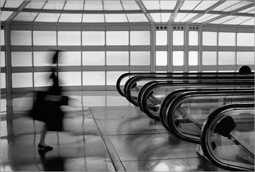 Chicago (O’Hare), photograph‚© 1993 Nicholas Hartmann
NH:The inkjet prints look deeper and richer to me, partly because the matt black returns almost no reflected light and makes the print surface disappear, and partly because with Photoshop (and with the right negative) I can get a truly complete range of tonality with no illegible highlights or shadows. With appropriate subject matter (especially natural materials such as stone) the inkjet prints also have a very appealing texture: looking back at the wet-chemical prints now, I find that in some of them, even at an 8 x 12" image size, the physical surface of the toned air-dried glossy paper tends to distract from the pictorial content.
Beyond that, all I can say is that I like them better.
The differences in aesthetic perception have also led to other changes:
Because I now have much better technical control over the entire picture-making chain, my confidence is greater and I am inclined to make more prints;
Because it is now just as easy to make big prints (up to the 10 x 15" image size) as small ones, and because the big prints look better, I now print bigger;
Big prints have a different kind of "presence," which feeds back in subtle ways into what kinds of pictures I take;
Big prints bring out not only all the detail of the negative but also all its faults, so I am getting more finicky about equipment and technique.
MJ:Right. Okay, I think we’ve established that words can convey nothing more about the real appearance of your prints than they can about any other piece of visual art. Is there any place where people can actually see your prints and make their own judgments about them?
NH:A group photography show calledLingua Franca 3 opens on July 26, 2002 at Gallery H2O, 907 S. 1st St., Milwaukee, Wisconsin, and runs through August 31. It will include fifteen of my framed prints (image size 10 x 15") as well as a couple of dozen other pictures, printed slightly smaller, available for purchase as unmatted prints. The opening reception runs from 6:00 to 10:00 p.m. and takes place on Gallery Night, Milwaukee’s quarterly art-crawl extravaganza (seehttp://www.easttown.com/gallery/mapJuly02.htmfor a useful map and more information). That’s the only venue for now.
Your readers are also welcome to visit the photography side ofmy Web siteorcontact me directlyto arrange for private showings.
MJ:Thank you for sharing all this, Nick.
NH:My pleasure.
 Nick Hartmann, photograph‚© 2002 by Mike Johnston
Part Iof this article is foundhere.
© Mike Johnston 2002
Mike Johnstonwrites and publishes an independent quarterly ink-on-paper magazine calledThe 37th Framefor people who are really "into" photography. His book,The Empirical Photographer, is scheduled to be published in 2003.
You can read more about Mike and findadditional articlesthat he has written for this site, as well as aSunday Morning Index.
You May Also Enjoy...
Lost in the Gutter
Lost in the GutterGood Morning. Well, I guess it is, anyway. As I write this it's "the Monday after," and I'm feeling dejected about the
One Tough RAID
It's a cliche, but one worth repeating – "The question isn't whether a hard drive will fail, only when". Never had a drive failure? You're
