A Technical View of Boke
by
Harold M. Merklinger
Harold Merklingeris a well regarded expert in the field of optics and author of several books on the topic. Boke (or Bokeh if you prefer), is the Japanese-originated concept of the difference between out of focus areas of an image due to lens design. This article will be heavy going for some, but should be of interest to anyone desiring a technical understanding of this complex and controversial topic.
Michael
Exploring the Out-Of-Focus
Photographers know that one of the characteristics that separates photographic imaging from drawing or painting is the matter of focus. When we humans look at the world about us, our autofocus eyes tend to see everything in-focus. And that’s the way artists have usually portrayed our world. While the main subject might be emphasized with brighter colors and greater detail, the less prominent objects were usually still rendered sharply. The lens‚ even the lens of the eye ‚ introduces an opportunity for selectivity in image-making, portraying objects in the near field and background with a special kind of de-emphasis: out of focus. Observant photographers have noticed that not all lenses are created equal: large aperture lenses show strong out-of-focus effects while small-aperture lenses lead simply to a softening of the image. And even among lenses of equal focal length and aperture, there are differences. The Japanese apparently refer to the quality of the out-of-focus image as "boke". What is boke, and why are lenses different from one another?
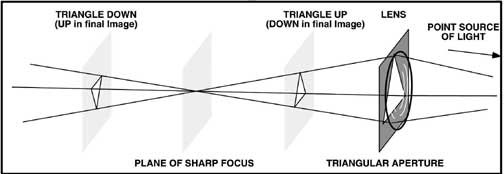 Figure 1
A triangular stop behind the lens results in a triangular cross-section beam of light focused on the plane of sharp focus. If the film were placed in front of the focus, an upwards pointing triangular image is produced while behind the focus, the image of the lens opening is upside down. (Remember, the photographic image itself will be upside down.)
Lenses, whatever their quality, obey the physical laws of optics and thus, I reasoned, boke should be explainable in straight-forward technical terms. It’s just a matter of convolution.
In the explanation that follows it seems fitting to begin with a painting analogy. We’ll look at photographic imaging as a special form of painting. We’ll then move on to discover how one lens‚ roughly analogous to a set of artist’s brushes‚ might differ from another. The analogy is not quite perfect of course: painters use dyes and pigments‚ subtracting light and color from the paper or canvas‚ while photographers build their images with light.
The concept ofconvolutionessentially means replacing every basic element of one image with a second image, but constraining the overall brightness of each replica of the second image to be equal to that of the image element it replaces. Then we add up the overall result point by point over the whole scene.
Let’s paint a picture using convolution. We start with a mental picture of every tiny detail in the scene to be painted. Our tools are round brushes varying from very fine to very coarse, and paints. To begin we choose a point on the most distant object in the scene. We mix our paints to match the color and brightness of that point, and then we measure out a very small amount‚ say one hundredth of a gram‚ of the mixed paint and apply it evenly to our brush. Because we are simulating a photograph with the camera lens focused on someone in the foreground, we choose for our first stroke a brush about one-quarter inch in diameter ‚ the size of the circle of confusion that might be produced on film by a distant point source of light. We position the brush over the canvas, centering the brush precisely over the point where that distant detail should appear in the image. We dab the brush to the canvas, transferring a faint quarter-inch diameter smudge to the canvas. Then we repeat the process over and over, detail by detail. We work with distant details first, then move to progressively nearer details, using smaller and smaller brushes as we go. When we get to the person we have chosen to focus upon, we use just a single bristle to apply that same 0.01 grams of paint to the canvas. Then as we work to objects yet nearer, we use progressively larger brushes again.
Throughout our painting we work detail by detail; only the size of the brush and the color of the paint change. If we had used the single bristle brush throughout, we would paint a perfectly sharp and detailed picture. But because we have been using various sized brushes, the objects in the background and extreme foreground are blurred out‚ just like the image produced by a camera.
The camera functions very much like a painter having access to set of round brushes of all sizes. The camera chooses the size of brush based upon pure geometry: the effective brush size depends only upon where the object is, where the camera is focused, and upon the aperture of the lens. The camera then paints a fully detailed picture, using an amount of light corresponding to that for each detail, spread over a disk the size of the circle of confusion appropriate for each detail in turn.
Boke, the quality of the out-of-focus image, is determined by the set of brushes: the circles of confusion characteristic of the lens, its aperture and how far out-of-focus it is.
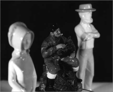 Figure 2
The effect of a triangular stop can be seen clearly in this photograph. Note the downwards pointing triangles on the figure in the foreground and the upward pointing triangles on the figure in the background. It all looks rather contrived, but everything you see is 100% natural. The example suggests we should avoid triangular lens stops.
To understand boke, then, we need simply look critically at the circle of confusion. Well, it turns out not to be quite that simple, but we’re very close.
Ideally, a lens produces a circle of confusion that is simply a uniformly illuminated shape corresponding to that of the lens aperture. The size (diameter) of the circle of confusion depends simply upon how far the film is from where that particular detail of the image is focused. Figure 1 illustrates the principle, but for a triangular aperture. For a triangular aperture we no longer see a circle of confusion, but rather a triangle of confusion.
Figure 2 illustrates an image taken with a triangular stop (aperture) placed in the lens. Notice especially how the out-of-focus highlights appear as triangles. In this case, the highlights nearer to the camera than the plane of sharp focus have the triangles pointing downwards, while highlights beyond the plane of sharp focus show as upwards-pointing triangles. (The triangular opening in the lens pointed upwards for this example.)
So, boke depends to a large degree upon the shape of the diaphragm opening. We probably should avoid triangles!
|
|
 |
| Figure 3 | Figure 4 |
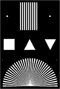
| The simple white-on-black test pattern used to determine some of the effects of aperture shape on the out-of-focus images. | Here’s the test target as photographed with an upwards pointing triangular lens opening and with the film too close to the lens. |
I tried photographing a test pattern (Figure 3) using openings of various shapes, and varying degrees of focus error. Figure 4 illustrates one of the results for the triangular aperture. Note especially the images of the out-of-focus triangles at the upper right of the figure. The triangle that happened to be oriented the same as the ‘triangle of confusion’ is rendered as sharp, if not evenly illuminated! The triangle oriented the other way around is more interesting. Here we see a six-sided figure with three bright lines through it. Now the really interesting part of this is that the three bright lines do not exist! They are a visual illusion! A densitometer trace (see Figure 5) through the six-sided image shows that the lines are actually just ‘corners’ where the brightness simply levels off at a value that is maintained across to the other side of the object.
What this illusion tells us is that the details of boke depend upon physiological effects as well as physical optics effects. It may be an illusion, but it still looks real to the eye, and related effects will be perceived in images‚ even if physical measurement fails to demonstrate the effect.
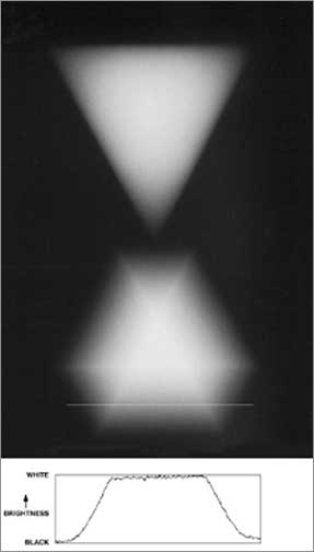 Figure 5
Here we see a portion of Figure 4‚ just the image of the triangles. The lower six-sided figure looks as though there are three white lines running through it. A fourth line has been intentionally drawn across near the bottom of the figure to show where a scan of image brightness was made. The scan, shown below the image, indicates that the image contains only intensity gradients and a ‘plateau’ area. There are no peaks corresponding to the positions of the white lines. The three white lines are a visual illusion.
Another principle illustrated by Figure 4 is that any object having edges that line up with the edges of the lens aperture will tend to be resolved to some degree. In Figure 4 we see, for example, that in the fan of lines at the bottom of the figure, horizontal lines and lines at approximately 30 degrees to the vertical are resolved, while lines at other angles are not. So what is the ideal shape for the lens opening? It depends upon the subject! A perfect circle is probably about as neutral as we can get: it shows some degree of spurious resolution for lines at all angles! The circle plays few favorites.
But photographers also know that particular lens designs have individual boke character, even when diaphragm shapes are similar. The Leitz 35/2 Summicron, for example, is reputed to have “good boke” while other some other lens designs give rise to “ni-sen” (double-line streaks) and other forms of “bad boke”. What makes the difference?
The lens I used for Figures 2 and 4 (a 150/6.3 Rodenstock Geronar) was pretty neutral in it’s boke. The circle of confusion as seen on a plain ground glass screen (by looking at the out of focus image of a pin hole illuminated from behind) was simply a uniformly illuminated shape, perhaps with just a touch of a thin bright outline around the perimeter. And the circle of confusion was much the same whether it was on the lens side of the plane of sharp focus or on the far side. The thin bright outline, I reasoned, is most probably a physiological illusion. Although a bright outline could be produced by Fresnel diffraction, we should see color fringing if that were the case. The outlines I saw appeared to be mostly white.
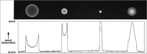 Figure 6
Here is a sequence of images of a pin hole illustrating the circle of confusion at four distances behind the Rodenstock Imagon. From left to right, the images were obtained 4 cm in front of the plane of best focus, 2 cm in front, at the plane of best focus and 2 cm behind it. Below the images is a graph showing the brightness of the image along a straight line through the centers of the circles.
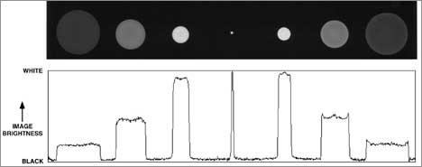 Figure 9
Here is a sequence of images of a pin hole illustrating the circle of confusion at seven distances behind the Nikkor-W. The brightness trace below shows that this lens demonstrates a ‘bright ring’ effect for images behind the plane of sharpest focus, while closer to the lens the trace show nicely rounded corners. The rounded corners can be expected to result in smooth, soft out-of-focus images.
The most unusual lens I examined was a 250 mm Rodenstock Imagon. Figure 6 shows a sequence of images of its circles of confusion at various distances behind the lens. On the lens side of the plane of sharp focus, we see a bright ring surrounding the circle of confusion. The circle of confusion is also smaller than it is supposed to be, although this fact only becomes obvious with careful measurement. Behind the plane of sharp focus, we see the reverse effect. The circle of confusion has a central bright core, and the overall diameter of the illuminated circle is larger than it should be. These effects are the consequences of intentional spherical aberration. Light from the outer periphery of the lens aperture is focused closer to the lens than the nominal focal length of the lens would suggest it should.
The convergence of these outer rays of the aperture becomes more obvious if we place one of the distinctive Imagon ‘sink-strainer’ stops in front of the lens. Figure 7 shows the result. On the left we see the distinctive sink-strainer pattern. At the next image, however, note that the two rows of holes have now converged to a single row. Fig 8 shows an enlarged view of these two patterns. The image at the far right of Fig 7 shows how the spots produced by the sink-strainer holes have become radial streaks.
Figure 9 shows a similar sequence of circles of confusion from a Nikkor-W 180/5.6 view camera lens. This lens shows a slight ‘bright ring’ effect on the opposite side of the plane of sharp focus (compared with the Imagon). I interpret this as a sign of over-corrected spherical aberration.
 Figure 7
This image shows the circles of confusion for the Imagon with one of its ‘sink-strainer’ diaphragms in place.
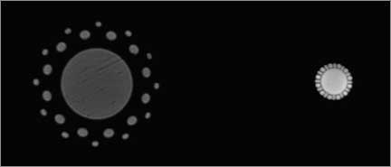 Figure 8
Here’s an enlargement of the left two circles of confusion from Figure 7. Note how the two circles of spots surrounding the central opening in the left image have converged to one circle in the right-hand image‚ clear evidence of spherical aberration. (The striations seen in these images are probably the result of a very slight smeared finger print later discovered on the back surface of the lens.)
The ‘bright ring’ effect is what I suggest leads to ‘bad boke’ and especially ‘ni-sen’. The ‘bright ring’ type circle of confusion allows some aspects of detail in the original scene to show up in out of focus areas and even to be replicated. An extreme example of the ‘bright ring’ circle of confusion is that produced by a typical mirror lens. Figure 10, by Kevin Hawk, shows a background out-of-focus spire as a very distinct double image.
The ‘bright core’ type circle of confusion is observed with the 35/2 Summicron on both sides of the point of focus. I suggest the bright core circle of confusion leads to pleasant out-of-focus images, provided the core is not too strongly concentrated. If the central bright core is too small, again some fine detail is painted into out-of-focus areas‚ although at least it is not replicated.
It is important to understand that many lenses will not display ‘good boke’ or ‘bad boke’ under all conditions. The ‘bright ring’ effect of the Imagon is brought under control to some extent by the sink-strainer aperture, but even so, this lens will show a smoother out-of-focus image for objects behind the main (in focus) subject. Out-of-focus objects closer to the camera will be imaged more harshly. Lenses like the 180/5.6 Nikkor, on the other hand, will show smoother out-of-focus images for objects closer to the camera than the main subject, and harsher images in the background. The Summicron gains its reputation by showing smooth out-of-focus images on both sides of the main subject.
It would be an over simplification to say that normal spherical aberration (as for the Imagon) leads to ‘good boke’ while over-corrected spherical aberration leads to ‘bad boke’, but it is probably true that out-of-focus backgrounds are more likely to be encountered and are potentially more disturbing than out-of-focus foregrounds.
Whether a lens exhibits the ‘bright ring’ or ‘bright core’ circle of confusion depends upon the details of how the spherical aberration is corrected. It will in general also change with the actual aperture used. And it can depend upon how the lens is corrected off-axis. In my tests, the 180/5.6 Nikkor yielded a slightly worse ‘bright ring’ effect off-axis than it did on-axis.
Another observation is that in order to exhibit even truly neutral boke‚ that produced by a simple evenly illuminated circle of confusion‚ some measure of aberration is necessary just to suppress the psychologically derived bright ring perceived when the circle of confusion is the physically ideal uniformly illuminated disk.
|
|
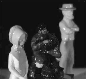 |
| Figure 10 | Figure 11 |
| Here’s the same scene as used for Figure 2, but this time photographed with the 180/5.6 Nikkor-W, with its standard round opening (at full aperture). We see nice soft highlights in the foreground and a slight ‘bright ring’ effect in the background. | Here’s the scene again with the 250 Imagon, using the H=7.7 stop in place. I intended to have to outer rows of sink-strainer holes closed, but there’s slight evidence here that one row of holes was open just a tiny bit. Nevertheless, the main effects seen here is the ‘bright ring’ out-of-focus highlights in the foreground and the ‘bright core’ highlights in the background. |
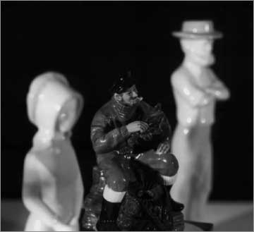
To close this discussion, I offer two last photographs. They are of the same three china figures seen in Figure 2. The 180/5.6 Nikkor-W was used to produce Figure 10, while the 250 Imagon was used to take Figure 11. The overall soft image of the lobster fisherman is evident in Figure 11, but the highlights on the woman in the foreground display a very definite bright ring effect and are quite annoying. By way of contrast, the Nikkor elicited very soft highlights in the foreground and a very sharp image of the lobster man. The highlights on the male figure in the background are similar in these two photographs, although close examination will reveal the slight bright ring effect of the Nikkor, and the bright core effect of the Imagon. Another effect can be seen in the highlight on the woman’s right eye. We see just half a circle in both photographs. What this means is that light from that particular highlight is quite directional, and only the bottom half of the lens was illuminated by it.
To summarize then, your camera paints its image with a repertoire of brushes whose characteristics are determined by the shape of the diaphragm opening and the details of the lens design’s aberrations. Some brushes are softer-edged than others, and that’s what makes the difference in boke.
Thanks to Oren Grad and Mike Johnston for helpful discussions in preparing this article.
This article was originally published inPhoto Techniquesmagazine in 1997
(c) Harold M. Merklinger, Halifax, Canada 1996.
A biography of Harold Merklinger is availablehere.
Michael Reichmann is the founder of the Luminous Landscape. Michael passed away in May 2016. Since its inception in 1999 LuLa has become the world's largest site devoted to the art, craft, and technology of photography. Each month more than one million people from every country on the globe visit LuLa.
You May Also Enjoy...
Convert your LLVJ DVD subscription to Download Video
or2 Standard Definition Download Video LLVJs for each unshipped DVD! Download Issue #18 of the Video Journal – Now Back Issues are also available DVDs
Sumachs and Brich
Please use your browser's BACK button to return to the page that brought you here.
