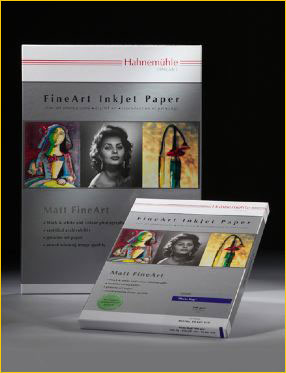
A variation on the Ogden Nash poem has it that –Candy is dandy, and rice is nice, but liqueur is quicker. To my knowledge no one has ever made paper out of candy, and I can think of better things to do with a good single malt than make pictures with it. But rice is another matter.
In Japan and other parts of Asia there is a long history of wood block printing and calligraphy using rice paper. My research shows that rice paper is not actually made from rice. It is in fact made from the pith of the rice paper plant,Tetrapanax papyriferus. That bit of arcana aside, rice paper has a unique look and feel that is much appreciated by non-photographic print makers. It is traditionally quite thin and delicate and up till now no one that I’m aware of has produced a rice paper coated for photographic inkjet printing.
I have also been told that the bark of the mulberry tree is used for the manufacture of what we call “rice paper”. Either way, I have no idea what Hahnemuhle is using in this instance, but it doesn’t really matter.
Enter Hahnemuhle
AtPhoto East Expoin New York in October, 2010 I was privately shown a prototype rice paper at the Hahnemuhle booth. There were two versions; a “natural” colour which was warm (yellowish) and also one with a more neutral tone (white). While it’s hard to judge anything in the hubbub of a trade show floor I was fascinated and impressed with what I saw. A couple of other photographers who were with me expressed similar interest.
About a month later I received a small sample pack of both papers from Hahnemuhle. I have now made a few prints, mostly in B&W since I have not had time to create a custom profile (and since the papers will likely change before production it would be a bit of a waste of time to do so in any event).
I was told that the natural tone paper , which does not have water lines embedded, will also be less yellow that the sample I received. The white paper has a velin surface with fine vertical watermark lines. These can only be readily seen when the paper is back lit, and to my eye is a lovely authentic touch. Both papers are 100gsm, which means that they are quite thin. The paper is intended for use with matte black ink.
Unfortunately paper is one thing that can’t really be shown or even described properly online. Describing a fine art paper is like describing the nose and taste of a fine wine. One can wax poetic but still never do it justice.
What’s it For?
This is not a paper that one would use for day-to-day printing. But, it has a beautiful tooth and transparency that I believe will make it ideal for a presentation portfolio. It is especially appropriate for monochrome work.
As soon as I have a production package to test more extensively I’ll let you know. In the meantime, I thought you might like to know about this exciting new paper that’s coming down the pike from Hahnemuhle. No price, sizes, or availability date has been set yet.
December, 2010
