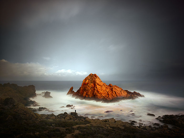
Technical Details: Phase One P45+ digital back on a Phase One 645 with a 28mm Mamiya lens, f8, 32 seconds, tripod mounted.
It’s good to have friends. Tony Hewitt and I had woken up for a dawn shoot and were on our way back for breakfast at Bunker Bay Resort, just west of Dunsborough in Western Australia. We were hunting for photos that Christian Fletcher, the local landscape photographer had missed. There weren’t many of them.
As we approached the turnoff to the resort, Tony suggested we take a quick look at Sugarloaf Rock, just to see what was happening. To be honest, I was happy enough to head in for a meal, but something inside me said we should go.
A few minutes later we pulled up in the car park and ran up to the top of the lookout. The scene was amazing. Below us stood Sugarloaf Rock, surrounded by an ocean in turmoil, glowing red and backed by dark storm clouds that were rapidly approaching. A break in the sky behind us was providing some amazing light and, having my trusty compact camera in my pocket, I fired off a few frames.
Seconds later the squall hit us.
The rain was horizontal, the winds fierce, the thunder exciting. There was no time for another shot so we retreated to the car and waited out the storm – perhaps ten minutes.
It was over as suddenly as it had begun. Unfortunately, the light had changed and our opportunity to capture that unforgettable scene was gone. I didn’t feel too bad because there certainly wasn’t time to pull out my big camera and do a long exposure, but to make myself feel better I decided to take the photo anyway. Breakfast could wait.
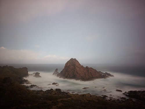
Tony and I spent a little time shooting the area in a number of different ways, lamenting the bright sunshine and lack of drama. And then I noticed some more large clouds heading towards us. Could we be so lucky? I decided on a spot in the rock cliff just below the lookout, jammed the tripod into position and locked the Phase One 645AF camera on top. We put on our raincoats and pulled down our beanies. I took a number of straight frames with exposures of around 1/30 to 1/60 second, as shown here.
 Time was running short and stress levels were heightened. The clouds were getting very close and the rain below them was torrential. It wasn’t going to be pretty, but I wanted to do a time exposure as well. I had to remove the lens from the camera, without touching the focusing collar, insert the neutral density filter (you can’t put filters on the front of the Mamiya 28mm lens), and return the lens to the camera. Was there time?
There was. Tony stood above the camera and pushed down. I held onto the tripod and fired the shutter. We had thirty seconds to wait. After ten seconds the squall hit us. Again, the rain was horizontal and the wind testing, but we held our ground for another twenty seconds until we heard the shutter close.
Then it was a mad scramble up the cliff and a bolt for the car. There was no point putting the camera away – it was already soaked and a few more seconds weren’t going to make a difference.
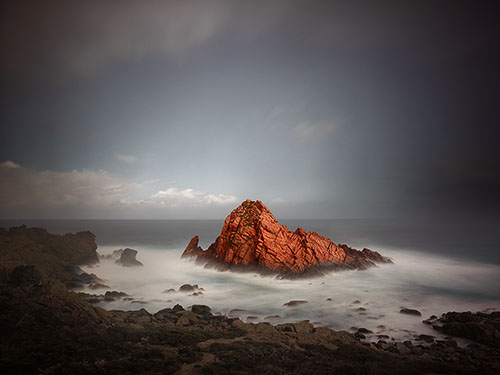
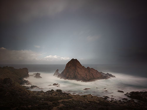 The resulting image (above) was a little flat (as was the light), but really moody. The ocean and the sky behind looked incredible, just requiring a little contrast and density to make them sing.
My only disappointment was with the rock itself, a dull, lifeless colour. It’s not what I remembered the first time I saw Sugarloaf Rock that morning, but no doubt Photoshop could help.
Preliminaries
Two files were combined to create the final image because there was a small amount of camera shake during the long exposure. Although the shake was hardly perceptible (Tony and I had done a stellar job in keeping the camera still under the circumstances), it was enough to annoy me, especially for the enlargements I had in mind. The solution was to use one of the earlier frames taken with the shorter shutter speed. These frames were tack sharp with all the beautiful texture and hardness of the rock retained. In comparison, if there was a little camera shake in the waves and the sky in the longer exposure, well, who cares! You can’t tell anyway. I spent quite a bit of time carefully masking the rock – more on this later.
With some of my landscape post-production, I like to work in Lab Color mode instead of RGB color mode. This is because Photoshop has some shortcomings when you make significant tonal changes: not only do you change the tone in RGB, but the color as well. Although you can correct this by changing the blend mode to Luminosity or Fading with Luminosity, this isn’t always practicable. So, I sometimes find the first step is to convert to Lab Mode.
Note, you can’t process a RAW file directly to Lab Mode, so when you process the RAW file, it’s important to output it to the largest RGB colour space you’re happy with. I use Joseph Holmes’ CAM3 colour space for my landscape work, but you can use ProPhoto RGB instead (as you would find on Lightroom and ACR). If you want to investigate Joseph’s colour spaces, please visit www.josephholmes.com.
Whether you convert to Lab Mode or not, the following approach still applies. And the following notes are not designed as a Photoshop lesson, but the steps taken to reveal the image in its final form.
Step 1
In terms of producing the image, the first step was to lighten the foreground, not a lot, but just enough to reveal some detail. The focus will be on the rock, but I wanted the small path in the bottom of the frame to be clearly seen. To achieve this, a Levels adjustment layer was added, but as I didn’t want to lighten the entire image, I used a large black brush on the mask attached to the Levels adjustment layer, blocking the effect from all the image except the foreground.
In a similar way, I then darkened the sky using several adjustment layers. I find that working in a number of small steps rather than one big step produces a more ‘invisible’ result.
Step 2
Visually it was important to separate the rock from the shore and there was plenty of water to accentuate this. The easiest way is to work on the highlight values – which is the churning water in this image. I added a Curves adjustment layer and, in the Curves dialog, just moved the top right highlight point to the left. This movement lightens all the values, but it lightens the highlights more than the shadow areas. Then the layer mask is painted on so that just the water is lightened and not the rest of the image. The result is a brighter, whiter sea surrounding the rock.
Step 3
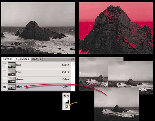
The next step is to place the sharp rock from the short exposure into position, so I open the other file and leave it in RGB mode. At first glance, it doesn’t seem too difficult to cut out the rock from its surroundings because its edges appear sharp. True, but the area where the rock meets the moving waves is fraught with difficulties!
Photoshop offers many ways to cut out objects (make selections). Sometimes it can be useful to go to your Channels palette and look at the red, green and blue channels one by one. Often you’ll find one channel clearly separates your subject. In this case, I found the Blue channel showed the rock as a much darker tone than its surroundings. I turned this channel into a selection.
Of course, the blue channel doesn’t make a perfect selection – some bits are missing and other unwanted bits are included. I switched to the Quick Mask mode (with its bright red overlay) and used a brush to manually fill in the recalcitrant areas, and paint other areas out. It didn’t take too long to isolate the rock. Click out of Quick Mask mode and you have your selection back. I then used this selection to delete the rest of the image, convert to Lab Color mode (only necessary because the other image was already in Lab), copy the cutout layer and paste it on top of the layer stack in the main file. Assuming both exposures were made with no camera movement, it will fit perfectly. In this case, some minor nudges were required to align the two layers.
Step 4
If you have done your selection properly, it should sit in position perfectly when pasted into the main image. However, a closer look at the cutout on its own revealed that the bottom of the rock where the waves are surging is just as sharp as the top of the rock set against the sky. When you paste the rock into the main image, it isn’t going to look completely believable. Your viewers will look at the photograph and instantly know what you’ve done. It’s not invisible Photoshop. What I needed was a mask that looked like the one below, with a soft edge around the base where the water was moving.

Since the sharp rock is on a transparent layer, it is easy to make a selection of it and, with the selection active, add a layer mask. In doing so, a perfect mask of the background rock will be added, revealing only the rock itself. Switch to a soft, black brush, click on the mask icon in the Layers palette to make the mask active, and brush along the bottom edges of the rock. Where you soften the edge of the mask, the rock and water from the main image below show through, hiding the tell tale sharp edge in the cut out image.
In this way you are using both hard and soft edges in a single selection, adapting the cut-out to what we would normally expect to see.
Step 5
The sharp rock is now in position, but its colour isn’t what I had in mind, so I made three adjustments using clipping masks so that only the rock was affected, not the image below.
First, the existing colour was adjusted with a Hue/Saturation adjustment layer, using the Hue slider to make the colour warmer and the Saturation slider to increase the saturation. Second, a curves adjustment layer was added in order to increase the contrast. Increased contrast serves to bring objects forward, while decreased contrast sends them back. Some people would be happy to leave the rock with a more natural colour, but I have never been particularly natural in my approach to landscapes! So I further increased the colour saturation.
Step 6
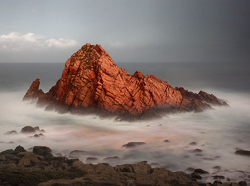
In the interests of believability (okay, okay, humour me here, please!), we need to pay attention to tell tales like reflections. Now that the rock is bright red, I felt I needed to have that colour reflected in the water below. Using a Hue/Saturation adjustment layer and a mask that just affects the water in front of the rock, and the water spray above the waterline, I adjusted both the hue (to make the area red) and the saturation (to increase the amount of color) to introduce a pink reflection.
Finishing Steps

To finalise the image, a series of minor vignettes and colour adjustments were made. I also added in a small figure for scale. I couldn’t convince Tony Hewitt to stand on the rocks. He said something about being washed away, but I couldn’t hear him properly as the squall intensified. I think that’s why he volunteered to hold the tripod steady! So, although Tony is a good friend, I had to resort to some Photoshop skulduggery to get him into position – a simple cut and paste job like the rock.
March, 2012
Peter Eastway has won the AIPP Australian Professional Photographer of the Year twice, and has been Australian Landscape Photographer of the Year three times. You may also have seen him on the Phase One website and working with Capture One software. Peter also publishes a number of photography magazines in Australia. You can see more of his work at www.petereastway.com, and more of his tutorials and articles (including his Landscape Photography MasterClass) at www.betterphotography.com.
About Peter Eastway APP-L, G.M. Photog., Hon. FAIPP, FNZIPP, Hon. FNZIPP, FAIPP Peter Eastway is an Australian photographer known internationally for his landscape photography and creative use of post-production. A practicing professional, he shoots editorially (mainly for Better Photography magazine) and works selectively in advertising and portraiture. Peter has been involved in photographic magazine publishing for over 30 years, establishing his own title, Australia's Better Photography Magazine, in 1995. As a result, Peter and his websites are a wealth of information on how to capture, edit and print, offering tutorials, videos and inspiration for amateur and professional photographers. Peter’s work has been published and exhibited internationally over the past 40 years. He was the author of the Lonely Planet’s Guide to Landscape Photography. His photography has featured on the cover of the Lonely Planet’s guide to Australia, in articles in the Qantas in-flight magazine, and in an international Apple television commercial. And he has worked with Phase One researching and promoting its high-end medium format cameras and Capture One raw processing software. He was one of the featured photographer in the first Tales By Light television series aired on the National Geographic Channel in Australia and produced in partnership with Canon Australia. It can currently be viewed on Netflix. Peter Eastway is a Grand Master of Photography, a Fellow and an Honorary Fellow of the Australian Institute of Professional Photography, and a Fellow and Honorary Fellow of the New Zealand Institute of Professional Photography. He won the 1996 and 1998 AIPP Australian Professional Photographer of the Year Award. He is a WPPI Master of Photography. He is an ambassador for a number of international photography brands, including Canson, Eizo, Epson, Momento Pro, Nisi, Phase One, SanDisk, The Edge Photo Imaging, Wacom and Zenfolio. Peter speaks nationally and internationally on topics including landscape photography, Photoshop techniques, publishing and the business of professional photography. Peter is in his fifties, rides a short surfboard, believes two skis are better than one, and in case you're buying him lunch, he is vegetarian.
You May Also Enjoy...
Lesser known locations of northern arizona
Lesser Know Locations Along The Way Agathla Peak Photographed with a Canon EOS D30 and 70~200 f/2.8L lens at ISO 100. Monument Valleylies north of
