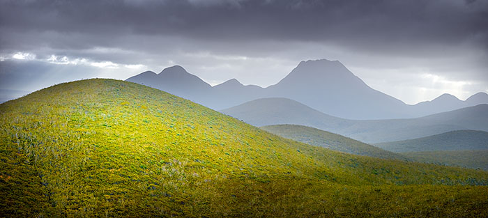
Australia is not known for its towering peaks and rugged mountain ranges. Indeed, its tallest mountain just tops 2,000 metres, so when you find a series of ‘hills’ like this, it is almost nirvana for an Austrailan landscape photographer!
The Stirling Ranges rise abruptly from the desert and disappear just as quickly, but if you follow one of the dirt roads through its heart, you’ll find a lookout with a view like this. Well, almost. This is taken from a higher vantage point above the lookout, clearing away the trees and bushes in the foreground.
With your permission, I’ll run through the steps involved in producing the final image because as you will see next, the original capture was quite different.
The photograph was taken in late afternoon and the scene is essentially backlit. The sun will drop into view in a couple of hours to the left of the foreground hill. There are some beautiful colours in the Australian landscape, but they are difficult to see under this dull and drab lighting. Unfortunately, our timetable meant we couldn’t return another day, so we shot what we could.
I used a Phase One IQ180 on a 645DF body with a 110mm Schneider-Kreuznach lens, set at f5.0 at 1/100 second and ISO 35. The file has been processed in Capture One and the exposure kept low to ensure I don’t lose any detail in the highlights. I probably shouldn’t process my files this way, but the medium format files are so forgiving that I seem to get away with it.
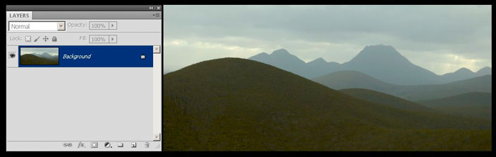
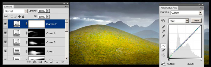
I’ve used a series of layers to enhance the photograph, which you will see in the Layers palette on the left. The respective adjustment (levels, curves etc) are also shown, except when I’m using a blend mode to make the change. The idea behind this article isn’t to teach you how to use layers, but rather to share the thought processes involved. While technique is incredibly important, it doesn’t get you far without an idea to drive it.
My idea was to recreate the light needed to bring this landscape to life. I love the folds of land, overlapping one another into the distance – there is surely something magical hidden within the file.
Step 1
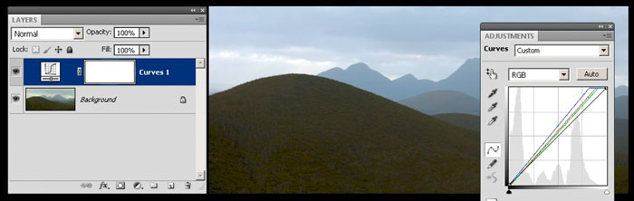
I add a Curves adjustment layer and press the Auto button. Don’t tell anyone about this as it’s a secret technique that works remarkably well! I find that Mr Adobe’s algorithm produces something that’s a little stronger than what I’ve produced by eye. Not always, of course, but it’s worth checking.
Step 2
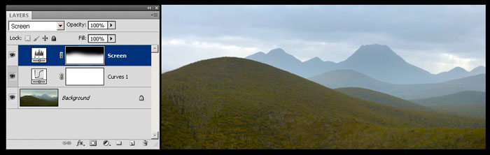
I tentatively lighten up the foreground, trying to better balance the tonal values in the sky. I was influenced by the LCD screen image shown to me by Michael Fletcher, who was shooting video at the same time. He created a time-lapse latter in the afternoon when the tonal values in the sky and land were similar. His rendition didn’t have strong colours, either, and colour is something that would happen later my the post-production process. At this stage, I’m not sure exactly how far I will need to push the file, so I make a start. The Screen blend mode on a Levels adjustment layer lightens up the image and the mask (you can see it in the Layers palette) holds back the sky.
Step 3
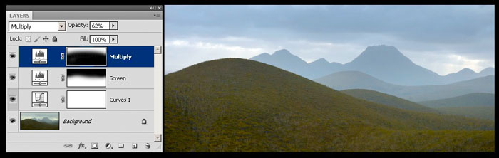
Lightening up the foreground to match the sky might be a big ask, so I look at darkening down the sky. I add another Levels adjustment layer and change the blend mode to Multiply. Then I dial back the opacity of this layer to 62%. The mask ensures only the sky is affected. There’s a lot more light in the image now, but I can see I need more.
Step 4

I add in another Levels adjustment layer set to Screen blend mode with 73% opacity to further lighten up the foreground, and in doing so, I can see some colour coming into the file. I haven’t (at this stage) used any colour adjustments, just lightened up the exposure. This process of exploration gets me thinking that some strong colour could be quite useful, but for the time being, I will continue exploring my original vision.
Step 5
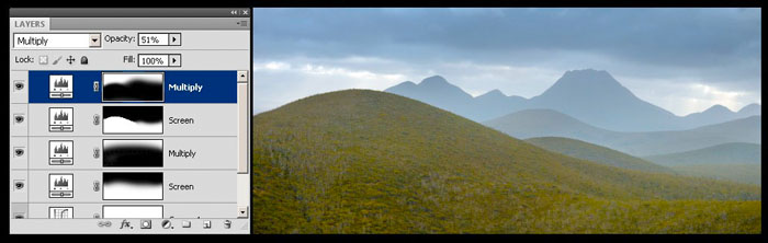
I darken down the sky a little more, trying to create a more threatening sky. A Levels adjustment layer set to Multiply blend mode does the trick (51% opacity), but I am noticing some colour changes in the sky. A distinct blue is appearing in the sky and this is not in my plans.
Step 6
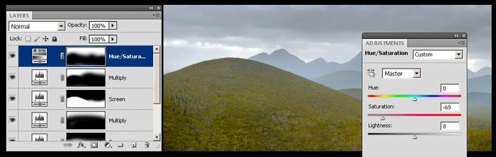
While I like the colour in the foreground (for no technical reason, I just do), I don’t want it in the sky, so a Hue/Saturation adjustment layer is added and the Saturation slider moved to -69, removing most of the blue from the sky. It also removes the colour from the foreground, so the mask is used to restrict the change to just the sky.
Step 7
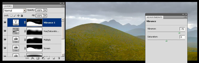
A Vibrance adjustment layer is added and the colours enhanced. The yellows and greens in the foreground are now much stronger, but I only want the foreground hill to be colourful. The background hills and sky can retain their monochromatic nature, so a mask is added to control where the colour falls.
Step 8
It might be a little difficult to see on your screen, but the foreground hill is a little ‘flat’, meaning it is lacking in contrast. Adding contrast can really give an image, or an area in an image, much more presence, so I add a Curves adjustment layer and steepen the curve to increase contrast. I then inverse the mask (so it is fully black), and then using a soft white brush, paint contrast into the foreground hill. This brings the hill forward in the composition and gives the foliage more definition.
Step 9
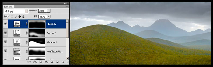
At this stage, I’m still thinking a relatively flat, even tonal range, so I darken down the sky a bit further using a Levels adjustment layer set to Multiply blend mode with an opacity of 68%.
Step 10
Then I add a vignette around the whole image, just to contain the eye within the composition. A Curves adjustment layer does the tick with the curve dragged downwards. The mask shows that just the edges are being affected.
I put the photo away for a day or two to let my thoughts digest. In some ways, I have achieved my initial vision, but I’m not sure that it is any good. When I return to the file, I can see that it is a little flat and uninteresting, like the light we had when I took the photograph. Something more needs to be done.
Step 11
My feeling is that I really need to emphasise the foreground hill by lightening it up, and perhaps by adding in a splash of colour or light. I add a Curves adjustment layer, but I carefully mask the foreground hill so that just the hill is lightened.
Step 12
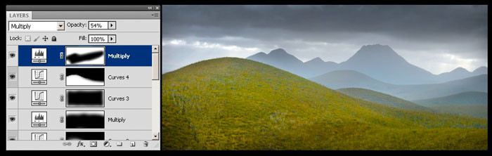
Sometimes you simply can’t lighten an area enough, because making it too light ruins the image in other ways. So, if you can’t lighten your subject, try darkening your subject’s surroundings. I add a Levels adjustment layer, set the blend mode to Multiply at 54%. I then use a large black brush to paint over the hill and the middle ground (see mask). This gives the impression of light coming from the right hand side in the background across to the hill on the left. This pleases me, but it’s too subtle.
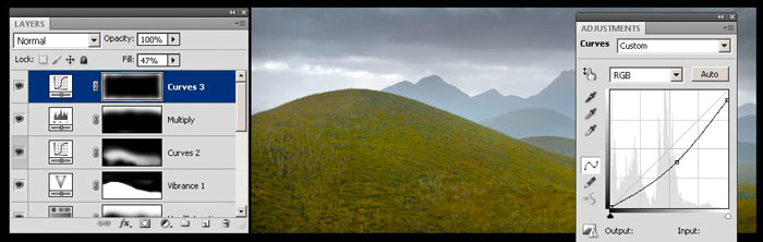
Step 13
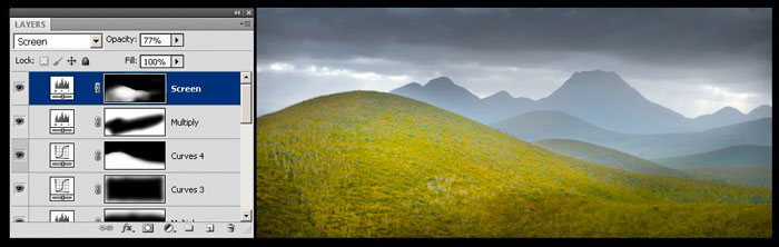
Maybe I can lighten the hill a tad more… I add a Levels adjustment layer, set the blend mode to Screen and 77% opacity. I invert the mask and then, using a white brush, paint in the hill as though it were being lit by a sunbeam.
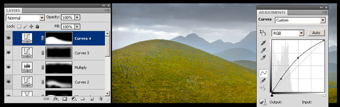
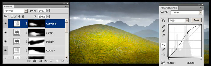
Step 14
I add in a Curves adjustment layer to lighten things up and increase contrast. I copy the mask from the previous layer and adjust it, creating a stronger ‘spot light’ on the hill. I adjust the opacity to taste – a correctly calibrated colour monitor is essential!
Step 15
The area of sky on the left of the frame behind the hill is a little light, so I add in a Curves adjustment layer and darken it down.
Step 16
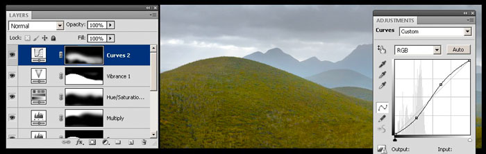
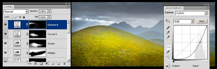
Finally, I add in another Curves adjustment layer and click the Auto button once again. Mr Adobe’s algorithm goes to work, making subtle adjustments to the distribution of tones and colours throughout the file and I like the result.
As I write this article, the image has been accepted into the International Loupe Award’s Medium Format category. It will be printed to one metre in size and exhibited around Australia and Asia, so I will have to do a little more work refining the masks that curl around the top of my green hill. When you’re making larger prints, any areas of visual displeasure are also much larger and need to be contained!
June, 2012
Peter Eastway has won the AIPP Australian Professional Photographer of the Year twice, and has been Australian Landscape Photographer of the Year three times. You may also have seen him on the Phase One website and working with Capture One software. Peter also publishes a number of photography magazines in Australia. You can see more of his work atwww.petereastway.com, and more of his tutorials and articles (including his Landscape Photography MasterClass) atwww.betterphotography.com.
About Peter Eastway APP-L, G.M. Photog., Hon. FAIPP, FNZIPP, Hon. FNZIPP, FAIPP Peter Eastway is an Australian photographer known internationally for his landscape photography and creative use of post-production. A practicing professional, he shoots editorially (mainly for Better Photography magazine) and works selectively in advertising and portraiture. Peter has been involved in photographic magazine publishing for over 30 years, establishing his own title, Australia's Better Photography Magazine, in 1995. As a result, Peter and his websites are a wealth of information on how to capture, edit and print, offering tutorials, videos and inspiration for amateur and professional photographers. Peter’s work has been published and exhibited internationally over the past 40 years. He was the author of the Lonely Planet’s Guide to Landscape Photography. His photography has featured on the cover of the Lonely Planet’s guide to Australia, in articles in the Qantas in-flight magazine, and in an international Apple television commercial. And he has worked with Phase One researching and promoting its high-end medium format cameras and Capture One raw processing software. He was one of the featured photographer in the first Tales By Light television series aired on the National Geographic Channel in Australia and produced in partnership with Canon Australia. It can currently be viewed on Netflix. Peter Eastway is a Grand Master of Photography, a Fellow and an Honorary Fellow of the Australian Institute of Professional Photography, and a Fellow and Honorary Fellow of the New Zealand Institute of Professional Photography. He won the 1996 and 1998 AIPP Australian Professional Photographer of the Year Award. He is a WPPI Master of Photography. He is an ambassador for a number of international photography brands, including Canson, Eizo, Epson, Momento Pro, Nisi, Phase One, SanDisk, The Edge Photo Imaging, Wacom and Zenfolio. Peter speaks nationally and internationally on topics including landscape photography, Photoshop techniques, publishing and the business of professional photography. Peter is in his fifties, rides a short surfboard, believes two skis are better than one, and in case you're buying him lunch, he is vegetarian.
You May Also Enjoy...
Photo to Movie
The world's of still photography and film making (video) and are quite separate artistic activities, yet they are very close in some of their tools
Chapel on The Hill
Please use your browser's BACK button to return to the page that brought you here.
