A few days after my tutorial on platinum/palladium printing was published here on Luminous Landscape I received an email from Ron Reeder (co-author of Digital Negatives: Using Photoshop to Create Digital Negatives for Silver and Alternative Process Printing) expressing some concern that I had characterized the use of Quadtone RIP (QTR) for printing digital negatives as a ‘dead end’. He pointed me to a recent update (May 2009) of his tutorial (version 3) on using QTR on a Mac to create the negative. Here’s a link to where the QTR application and user guides can be downloaded. My initial attempts at using QTR were based on a previous version. Since I was already conceptually predisposed to the concept of using a RIP instead of Photoshop curves I agreed to have another look based on his updated content.
Before reporting the results I want to say that being a PC user I found that combining the instructions for creating digital negatives for a Mac and the QTR user guide for the PC was not particularly intuitive. The Mac method is quite different from the process for a PC since QTR for the PC comes with a standalone printing application not available for the Mac. For these reasons I’ve included a short tutorial on using the PC version of QTR to create digital negatives which should be applied in conjunction with the most recent version of Ron’s tutorial.
________________________________________________________________
The Results
In one word, excellent. In just a few days, with only 8 iterations (one of which was a user error where I adjusted the parameters in the wrong direction) I was able to produce a negative that was noticeably superior to what I’d been generating with countless tweaks using a combination of 2 Photoshop curves. The timing was fortuitous as I was switching media from Pictorico to InkPress and that required a major re-engineering of the profile. I do add one caveat: one of the purposes of my original article was to highlight the pitfalls that a beginner might experience pitfalls that simply may not be apparent to a long term practitioner and my initial experience with QTR in particular and digital negatives in general was not atypical. I suspect the ease with which I was able create high quality negatives over the past couple of weeks using QTR is predicated at least to some extent on the time I invested almost a year ago in attempting unsuccessfully to work through that methodology. I hope this tutorial will reduce at least some of the frustration that can occur when attempting to master the process of creating a digital negative for platinum or palladium printing.
Below (again suffering considerably from translation to the web) are 2 samples of palladium prints. The first, on the left, is a scan of aChartThrobstep wedge printed using Photoshop curves and the second is using QTR. Both have been converted to grayscale and Ive added a gradient to each step wedge since the wedge alone doesnt tell the whole story. In addition to being significantly easier to derive, the QTR version has smoother tonality and a more even gradation. The apparent graininess in the highlights is a result of the Arches Platine paper texture.
<![endif]–> Â Â Â Â Â <![endif]–>
     <![endif]–>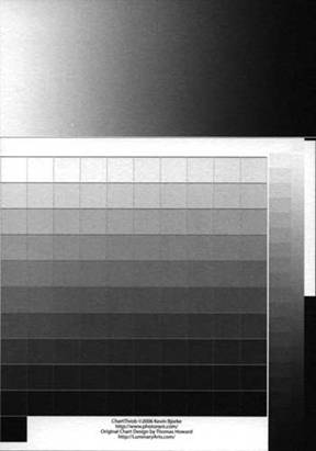
Photoshop curves QTR
You can stop here if you have only a passing interest in the subject, but if you’re interested in actually making a digital negative, and use an Epson printer (QTR only supports Epson, but the same principles should apply to any RIP), I encourage you to press on!
________________________________________________________________
The Process
QTR allows the user complete control of how much ink is laid down for each of the available colours. This ability to closely manage ink density allows you to establish the precise amount of ink needed to set the appropriate black and white points without altering the native image in any way. QTR also has the capability of reading a Photoshop .acv curve file to provide for any additional adjustments required. This curve is created in Photoshop only for convenience and is applied as part of the printing process from QTR with no impact on the original file.
Heres a screen grab of the QTR basic print screen. This is pretty well self explanatory, and I never encountered any difficulty in using it to print traditional BW inkjets. Just mouse over the Printer (top right) then select the Epson printer youre using. The advanced adjustments arent used.
<![endif]–>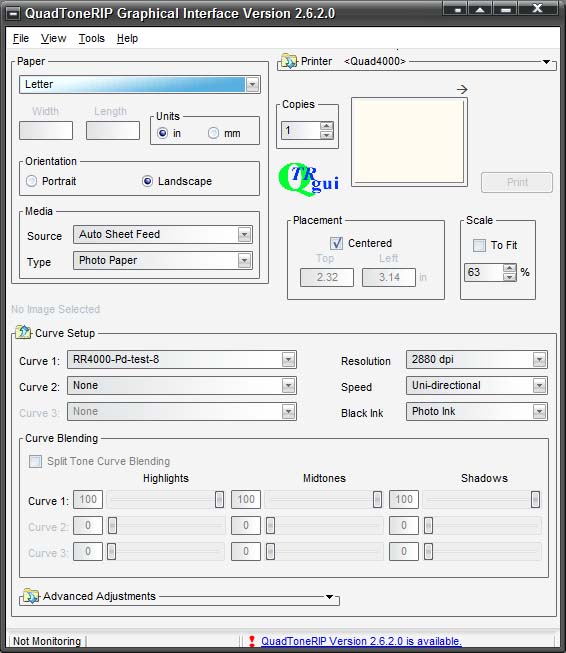
QTR print screen
On the off chance that you might be using InkPress transparency film, the instructions that come with the media indicate you should use 1440 dpi. I confirmed with them that the media handles 2880 without issue and Ive encountered no problems. Ill also note that the auto sheet feed works fine for single sheets of the film, eliminating the frustration of hand feeding.
The only real choice for this page, other than which profile (ie: curve) to use, is which ink: photo or matt black. You can decide by calling up Calibration Mode (Tools; Options; Calibration Mode). This loads a color file with each row representing a specific ink. Print this image on your film (you have no choice but to print as a positive) and make a pt/pd print. You can look at the K (black) and MK (matt black) rows and select which one has more white (ie least transmission of UV light) and choose that ink. For me, the K ink was marginally more effective than MK.
________________________________________________________________
Editing the QTR Profile
There are 2 ways to edit the profile: first, using a text editor (Notepad seems to work best), or second, the QTR interface under Tools; Curve Creation. When QTR is installed, 2 directories are created under the QuadToneRIP directory: Profiles and QuadTone. Profiles contains further sub directories for each of the printer/ink combinations supported and each of these sub-directories contains files with .QIDF extensions, one .QIDF file for each paper (and neutral, cool, warm etc. characteristics). These .QIDF files are editable either as text files in Notepad, or through the QTR interface. The second directory contains the same printer structure and a .QUAD file that corresponds to each .QIDF file. The .QUAD files are not editable and these are the ones actually used by the application to print.
If you edit the .QIDF file in QTR and save it, there is no issue since the process of saving the file in QTR creates the required .QUAD file. The trap is that if you edit the .QDIF file in a text editor, after saving the changes (no spaces in the name are allowed), you MUSTgo back into QTR, under Curve Creation, select and open the file just edited and then save it from QTR, otherwise the .QUAD file is never generated and that curve profile wont be on the Curve 1 drop down list from the Print screen.
When you want to print using the adjusted profile, select that file from the drop down for Curve 1 in the Curve Setup section of the print page. Curve 2 is not used. (As an aside, for printing in BW, a number of the curves provided with the basic install have no neutral curves. Instead Curve 1 is loaded with a warm curve and Curve 2 is loaded with a cool curve or vice versa – and the Curve Blending is set to 50/50 for the Highlights, Midtones and Shadows.)
Heres a screen grab of the main screen of the Curve Creation dialog in QTR showing the parameters Im currently using followed by the text file of the same profile printed from the .QIDF file. Since the terminology of the text files doesnt entirely map to the user interface, the numbers in red map the variables in the Ink Setup page to the text printout.
<![endif]–>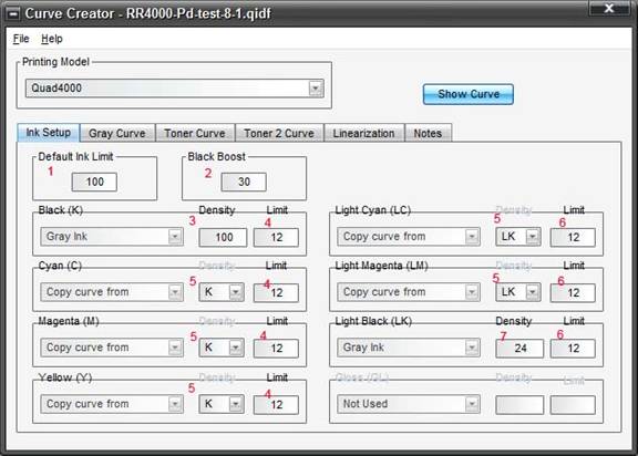
Qtr curve creation
#Notes 1 June 21 2009, 20:56 25 18 32
#Notes 2 June 22 2009, 18:40 12 09 50
#Notes 3 June 22 2009, 19:43 25 15 20
#Notes 4 June 25 2009, 16:25 20 13 17
#Notes 5 June 26 2009, 16:30 25 10 12
#Notes 6 June 26 2009 18:22 30 10 12
#Notes 7 June 27 2009 08:29 30 15 12
#Notes 8 June 27 2009 09:25 30 12 12
PRINTER=Quad4000
CURVE_NAME=RR4000-Pd-test-8-1
GRAPH_CURVE=YES
N_OF_INKS=7
DEFAULT_INK_LIMIT=100 1
BOOST_K=30 2
LIMIT_K=12 4
LIMIT_C=12 4
LIMIT_M=12 4
LIMIT_Y=12 4
LIMIT_LC=12 6
LIMIT_LM=12 6
LIMIT_LK=12 6
N_OF_GRAY_PARTS=2
GRAY_INK_1=K
GRAY_VAL_1= 100 3
GRAY_INK_2=LK
GRAY_VAL_2=24 7
GRAY_HIGHLIGHT=0
GRAY_SHADOW=0
GRAY_OVERLAP=
GRAY_GAMMA=1
GRAY_CURVE=C:tim_qtrqtr-8-1-grayscale.acv
N_OF_TONER_PARTS=0
TONER_HIGHLIGHT=0
TONER_SHADOW=0
TONER_GAMMA=
TONER_CURVE=
N_OF_TONER_2_PARTS=0
TONER_2_HIGHLIGHT=0
TONER_2_SHADOW=0
TONER_2_GAMMA=
TONER_2_CURVE=
N_OF_UNUSED=0
COPY_CURVE_C= K 5
COPY_CURVE_M= K 5
COPY_CURVE_Y=K 5
COPY_CURVE_LC= LK 5
COPY_CURVE_LM= LK 5
The above is for an Epson 4000 and from RonsArticlessite you can download a sample for the newer printers with an additional Light Light Black Ink. There are instructions in version 3 of the user guide on how to adjust the profile for those printers. The basic idea is to forget about using the LLB ink.
The Ink Setup page is really the only one you need to tweak. For the remaining tabs, here are the default parameters:
Gray Curve: Highlight = 0; Shadow = 0; Overlap = blank; Gamma = 1. If you use a Photoshop .acv curve the location goes in the Curve box. (More on the curve later).
The Toner Curveand Toner 2 Curveare both Highlight = 0; Shadow = 0; Gamma = blank and no curve.
Linearizationis blank
Notesare whatever notes you want to record. Its useful to use this to record an ongoing diary of your progress. You can see from the .QIDF printout above that Ive tracked each of the 8 iterations. After the date and time, the 3 numbers are the Black Boost, Dark Ink Limit and Light Ink Limit respectively.
The easiest way to create a new curve is to click on Tools from the Print application, select Curves Creation; File; Open an existing curve, apply the changes then save it under a new name (no blanks in the name). After youve saved it, its interesting to look at the ink density curves that QTR applies, by clicking on Show Curve available on any of the Curve Creator screens.
Heres a quick outline of what the variables on the Curve Creator Ink Setup screen mean.
Default Ink Limit: is set to 100 but is overridden by the individual Limits set for each ink. The Limit is the maximum amount of ink that will be laid down for any of the colors.
Black Boost:sets an exponential boost to the K ink limit.
Black (K): set to Gray Ink, this is QTRs default curve for the black ink the drop down lets you choose other curves, but that isnt necessary.
Density: always set to 100
Limit: set to what ever works this limits the amount of the specific ink laid down.
Cyan (C)Copy Curve from K: takes the same curve as set under the Black (K) variable. Similarly the Density follows K and the Limit can be set independently.
Magenta and Yellowhave the same explanation as does Cyan.
Light Cyan (LC):copies the curve from LK (the QTR default curve for LK) and the Limit is set to whatever works. Similarly for Light Magenta.
Light Black (LK):Density is the point at which K takes over from LK and doesnt need to be changed since I understand this to be a characteristic of the ink set. In Rons tutorial he notes that for Ultrachrome Inks the number is 24 and for K7 its 30. More technically, in this example 24 is the K ink limit that corresponds to a 100 limit for LK.
While you can tweak each colors Limit independently, its easiest to treat each of C, M, Y, and K to the same limit and LC, LM and LK to a separate limit. Its purely coincidental that the limits for the dark and light inks are the same in this profile. But the fact that all the dark inks are the same and all the light inks are the same is intentional. It should go without saying that the printed negative may have a color cast. This is totally irrelevant since its only the UV transmission characteristics that matter.
The following is an illustration of the Show Curve display for the above profile. The vertical axis is the ink limit and the horizontal axis goes from light to dark (as the ink is laid down on the negative) ie: going from total transmission of UV light on the left to total opacity on the right. The red numbers relate back to the screen grab of the Ink Setup Dialog in QTR. If you play with the variables and do a Show Curve for each iteration , its easy to see whats going on.
<![endif]–>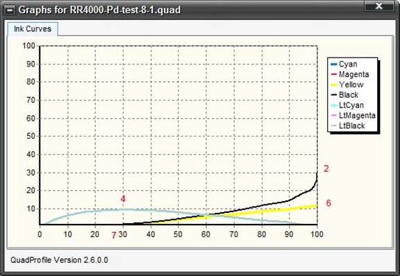
QTR Show Curve.
The red numbers map to the text output and Curve Creation above.
On his articles page noted previously, Ron has sample profiles for pd prints for the Epson 4000 and 3800. He cautions, and I reiterate, that while these are reasonable starting points you really need to adjust these based on your environment. For example, my Epson 4000 profile is quite different: I use a different concentration of Na2 contrast agent and a different film media.
________________________________________________________________
The Iterations:
So by now youve probably figured out that the amount of dark ink laid down on the negative sets how the highlights in the positive image come out and the light inks drive the shadows. The iteration process is relatively straight forward. Start by adjusting the light ink limits so that in the shadows you can just barely discern the difference between the 2 darkest steps. If youre using ChartThrob, I dont mean the difference between the 100 th and the 101 st steps, but based on the left hand column or the small wedge on the right hand side of the chart. Similarly for the dark inks and the lightest of the steps. These 2 variables can be modified at the same time. Once these Limits have been optimized you can adjust the Black Boost variable to drive how fast you move from paper white to the darker shades. If you look at the .QIDF printout above and the notes of the progression of my iterations youll see that I was unable to resist the temptation to adjust all 3 variables at the same time. By playing with the Show Curve display you can see where the effect of changing the Black Boost will happen 2in the QTR Show Curve illustration above.
Tweaking with a curve.
At this point in my own process I ended up with a profile that was very good, without a supplemental adjustment curve (what a pleasant surprise!), but I wanted to see what incremental improvement could be made by tweaking the curve. I could tell from the step wedge that the tonality was already very linear so I knew that any curve adjustments would be minor.
As I mentioned in the main article one of this difficulties I had with using the scan and measure technique of curve generation was that the output of my scanner was off kilter. The scanner, an Epson V200 photo (cheap, I know) is profiled with Mike Chaneysprofile prism. His software includes an assessment of the quality of the profile and mine was poor. Heres the problem: the following is a scan of a QTR inkjet print of the ChartThrob wedge file. The print is perfectly fine and should generate basically no adjustment curve from ChartThrob. Instead, this is the curve that results:
<![endif]–>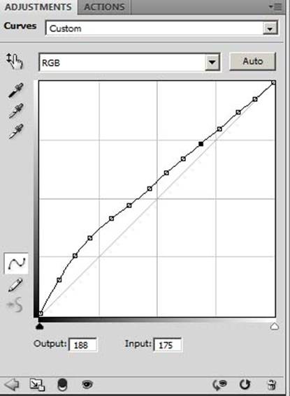
Inkjet adjustment curve
In a perfect world this would be a straight line on the diagonal, ie no variation.
Based on the assumption that the scanners output, if not accurate, is at least consistent, I decided to use the above curve as the reference against which to compare a QTR pd print of the same file.
Heres a rundown of the process. This may seem a bit complex but basically all thats happening is that a scan of a pt/pd print is being compared to a scan of an inkjet print and the differences used to create a normalized adjustment curve for the pt/pd. ChartThrob isnt strictly necessary for this process, any step wedge will serve. I use ChartThrob because it applies a blur; average separately against each step of the wedge and I find this works a bit better than applying a uniform Gaussian blur to the entire image.
1. Run the ChartThrob script from Photoshop to create a step wedge file.
2. ChartThrobs file is 8 bit so convert to 16 bits.
3. Add a gradient section to the top as per the previous illustrations. This has no impact on the actual process but the gradient gives a more intuitive feel for the quality of the profile than simply looking at the various steps.
4. Use Photoshop (or QTR) to make a normal inkjet print of ChartThrob.
5. Scan and load the inkjet print back into Photoshop but leave in RGB, ChartThrob insists on an RGB file so Grayscale wont work for this step. Set the appropriate black and white points its important to use the same method for setting the black and white points in both the scan of the inkjet and the subsequent pd/pt positive.
6. Run the ChartThrob script to generate an .acv curve. The curve thats generated has no value (in my case your mileage may vary) but the script does a nice job of doing a blur; average separately to each step of the wedge.
7. Invert the image since you will be printing negatives with QTR, the normalization must be done against a negative.
8. Measure and note the value of 16 steps including 0 and 255. You want more samples in the toe and shoulder of the curve than the mid tones, which are normally relatively linear.
9. Write these numbers down on a piece of paper or enter into a spreadsheet.
10. Print a negative on film of the ChartThrob wedge and gradient using QTR. In the Curve Setup section of the main printing page select the profile you created with the Curve Creation dialog.
11. Print out normally using pt/pd methodology and scan the resulting positive.
12. Load the scan into Photoshop and convert to BW (RBG, convert to BW set black and white points etc.) and run the ChartThrob script to create a curve and blur each step. Invert this image to a negative.
13. Measure the same steps and record the values to the right of the first column. These paired values are the output/input values to create a curve.
14. Go back to Photoshop and open any image (you simply need a working space to create the curve). This time make sure the image is converted to grayscale.
15. Create a curves layer and go into the curves dialog and under Curves Display Options make sure Light is selected. When manually tweaking the curve subsequently you need to remember that you are adjusting the ink on the negative so if you want lighter shadows you need more ink on the negative so you must drop the curve in the highlights area of the curve to make the negative shadows darker. (Note: I know this is confusing while this example is predicated on a Curves Display Option of Light developing the curve using the Ink setting may help clarify the process.)
16. Drop a point anywhere on the curve and enter the Output/Input coordinates for that first point. The first column (the results from the inkjet reference print) is the Output and the second column (the results from the pt/pd print) is the Input. Drop a second point on the curve and enter the coordinates for the second measurement. Repeat for all the data points you measured.
17. Once the curve has been created, save someplace you can easily browse to (again, no spaces in the name).
18. From the Gray Curve tab in the QTR Curve Creator browse to the .acv curve and select. The following is why its important for the curve to have been generated from a grayscale image: if its not grayscale, youll get a cryptic error message when you go to save the QTR Curve and the Curve Creation will fail.
Here are the data points I noted (including 255 and 0). The first column is from the pd image and the second column is from the Inkjet reference.
PD
Inkjet
Output
Input
0
0
23
16
44
44
60
62
76
80
90
97
134
138
158
164
184
190
204
211
214
223
226
234
234
239
244
249
250
249
255
255
And this is how the above curve looks. In point of fact it seems that the variation from a straight line is within the error of the scanning process because applying this curve in QTR results, to my eye, in a print that is less satisfactory than using no curve whatsoever. This is probably more good luck than good execution. You should probably smooth out the curve and it can be tweaked as desired in Photoshop.
<![endif]–>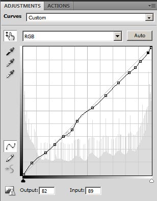
Final curve sample.
Id be happy to hear any comments either through the Luminous Landscape discussion forum, or email via my web site: www.timgrayphotography.com
January, 2010
________________________________________________________________
About Tim Gray
Tim was raised in Calgary Alberta but has called Toronto Ontario home for the past 20+ years. He acquired his first digital camera in 1999, when 2 mpx was considered “high resolution”. His immediate objective was photographing the millennial fireworks from his condo window. That Nikon Coolpix 950 camera, an Epson 1270 printer and the fireworks were enough to trigger a passion for photography that grows every year. Preferring the simple landscape, his photography has taken him from the cityscapes of downtown Toronto to as far afield as Antarctica. Lacking experience in the analog darkroom Tim felt a desire to connect with some of the deep historical roots of photography and acquired a taste for the time honored technique of hand printing with platinum and palladium. Tim’s work (but alas, not the noble metal prints) can be viewed, and he can be reached via his website:www.timgrayphotography.com.
Elevate Your Vision


Read this story and all the best stories on The Luminous Landscape
The author has made this story available to Luminous Landscape members only. Upgrade to get instant access to this story and other benefits available only to members.
Why choose us?
Luminous-Landscape is a membership site. Our website contains over 5300 articles on almost every topic, camera, lens and printer you can imagine. Our membership model is simple, just $2 a month ($24.00 USD a year). This $24 gains you access to a wealth of information including all our past and future video tutorials on such topics as Lightroom, Capture One, Printing, file management and dozens of interviews and travel videos.
- New Articles every few days
- All original content found nowhere else on the web
- No Pop Up Google Sense ads – Our advertisers are photo related
- Download/stream video to any device
- NEW videos monthly
- Top well-known photographer contributors
- Posts from industry leaders
- Speciality Photography Workshops
- Mobile device scalable
- Exclusive video interviews
- Special vendor offers for members
- Hands On Product reviews
- FREE – User Forum. One of the most read user forums on the internet
- Access to our community Buy and Sell pages; for members only.
You may also like